When Matt and Tara Riley planned to partially remodel their Mediterranean-style home in Manhattan Beach, they envisioned a modern spin on Spanish design with more open living spaces for their young family. After they enlisted the talents of Redondo-based architect Joe Spierer and Ben Archer of Archer Building Group, the team took their dream home vision to the next level with a greatly expanded scope of work.
“We purchased the house in 2018 and planned to replace all of the floors and windows and remodel the kitchen,” shares Tara. “We were also interested in minimizing the three different floor levels on the first floor, eliminating some of the interior columns and opening the back of the house. Once we spoke to Joe and got some preliminary construction costs, the project snowballed because there wasn’t any easy place to draw the line if we wanted to complete all the desired tasks.”
The architectural transformation by Joe was beautifully realized with a redesign that included numerous arches and timeless detailing. The espresso-colored exterior wood finishes (including riveted garage doors, entry gate and dark rafter tails) added grounding visual interest against the vast white stucco backdrop capped with a traditional Spanish-style tile roof.
“Classic Spanish architecture is usually heavy,” says Joe. “Modern Spanish style is less weighty with an updated contemporary feel to bring it into current times, which is what the Rileys wanted. Instead of the traditionally heavy architectural detailing, we kept it simpler and lighter with clean lines, smooth stucco installed right up to the window frames, and minimalized dark metalwork at the windows and railings.”
“Our family spends much more time together since remodeling the home.”
Ben embraced the spirit of the project at the construction helm. “This is a remodel on paper, but it is really a new home for all intents and purposes,” says Ben. “The footprint of the house remained largely the same, but we stripped everything down to the studs on both floors and built everything back brand new. We opened the downstairs by removing several walls and columns between the formal living room and the dining room, and we also raised and lowered the floors to make the flow of the home seamless. The floor plan upstairs basically remained the same.”
The front entrance echoes the overall style with a defining statement that is refined and not too heavy. Upon entering the home, visitors are welcomed by a continuation of fresh white walls, wide-plank oak floors, vaulted ceilings, a showstopper custom light fixture and an abundance of natural light. The expansive open space at the back of the home (also repeated on the second floor) pulls the outdoors in and beckons curiosity—a feat that was Ben’s greatest building challenge on the project, albeit a rewarding one.
“In order to open up the entire back of the house to allow for the multi-slide La Cantina doors, we needed a lot of steel,” he notes. The largest beam was just over 40 feet long and weighed almost 6,000 pounds—roughly the weight of a small elephant. Typically, we use a crane to hoist and lower large beams like this into place, but this project had power lines in front of the building that blocked crane access. All of the massive beams had to be muscled into place by hand with carts, dollies, jacks and a lot of elbow grease.”
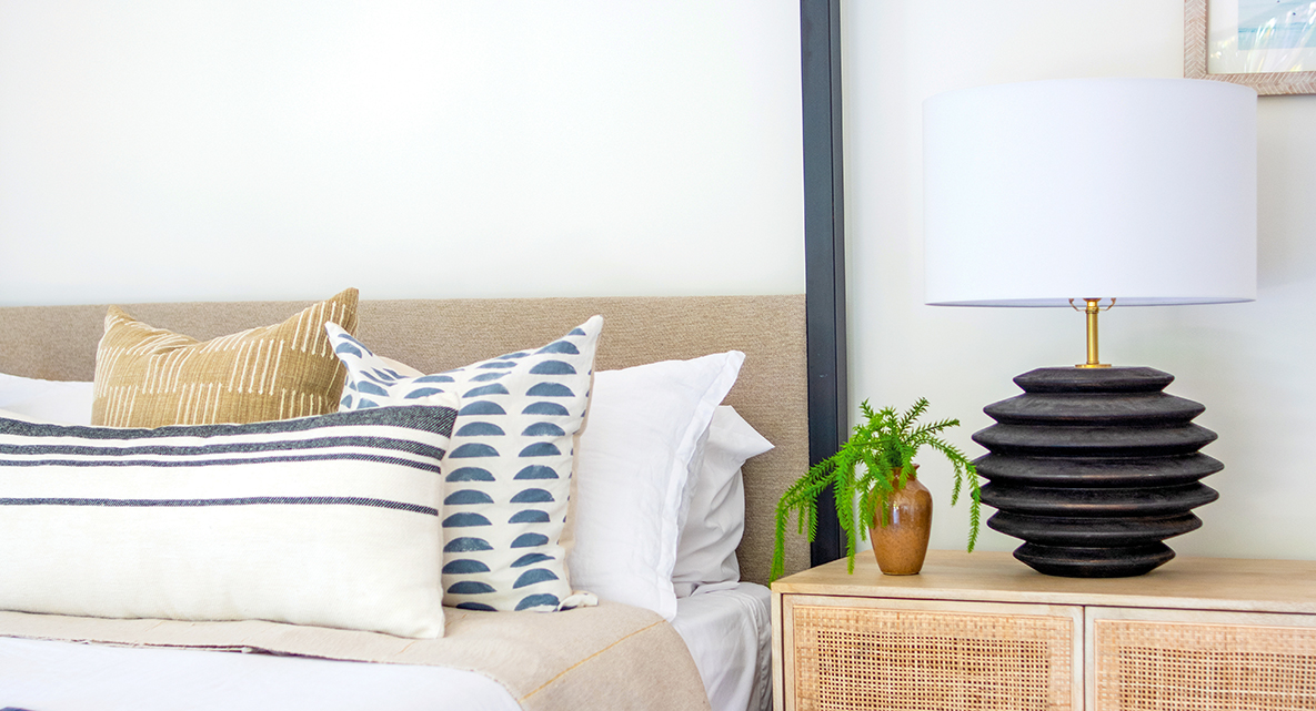
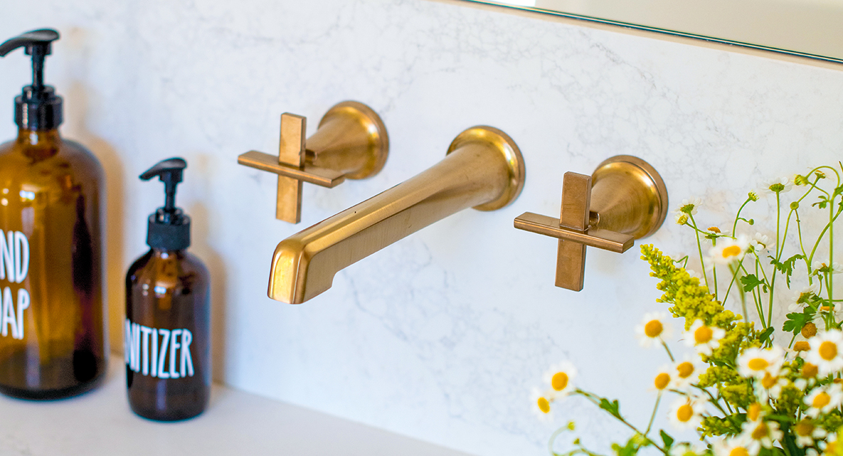
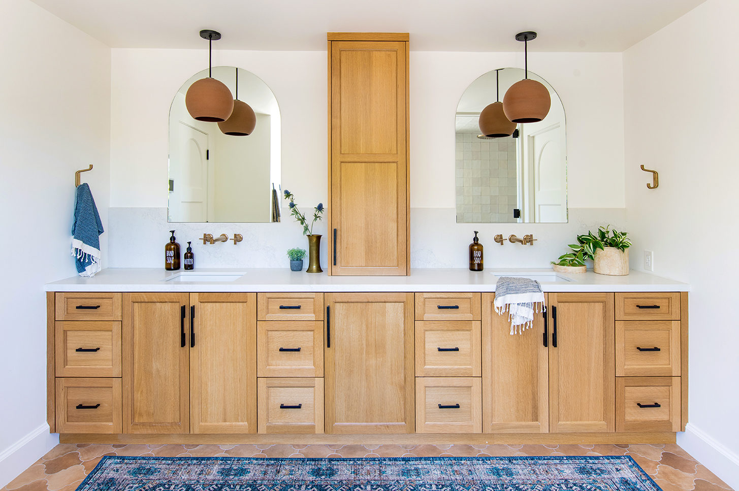
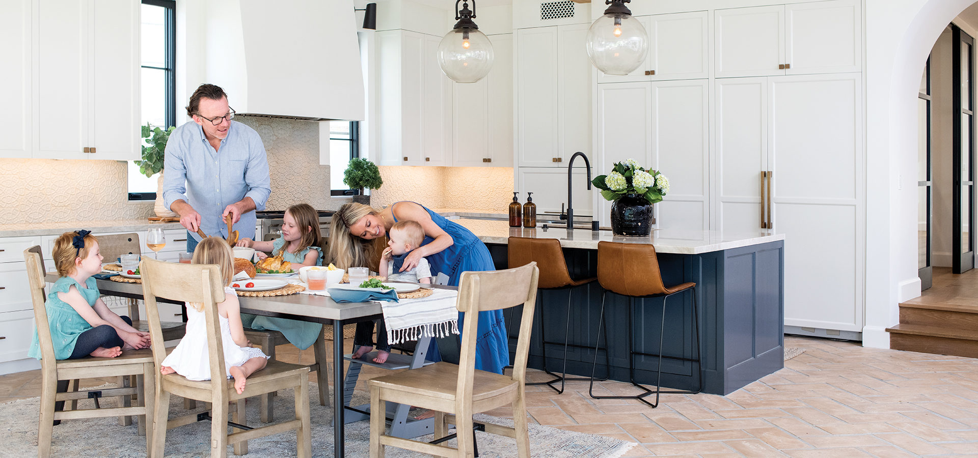
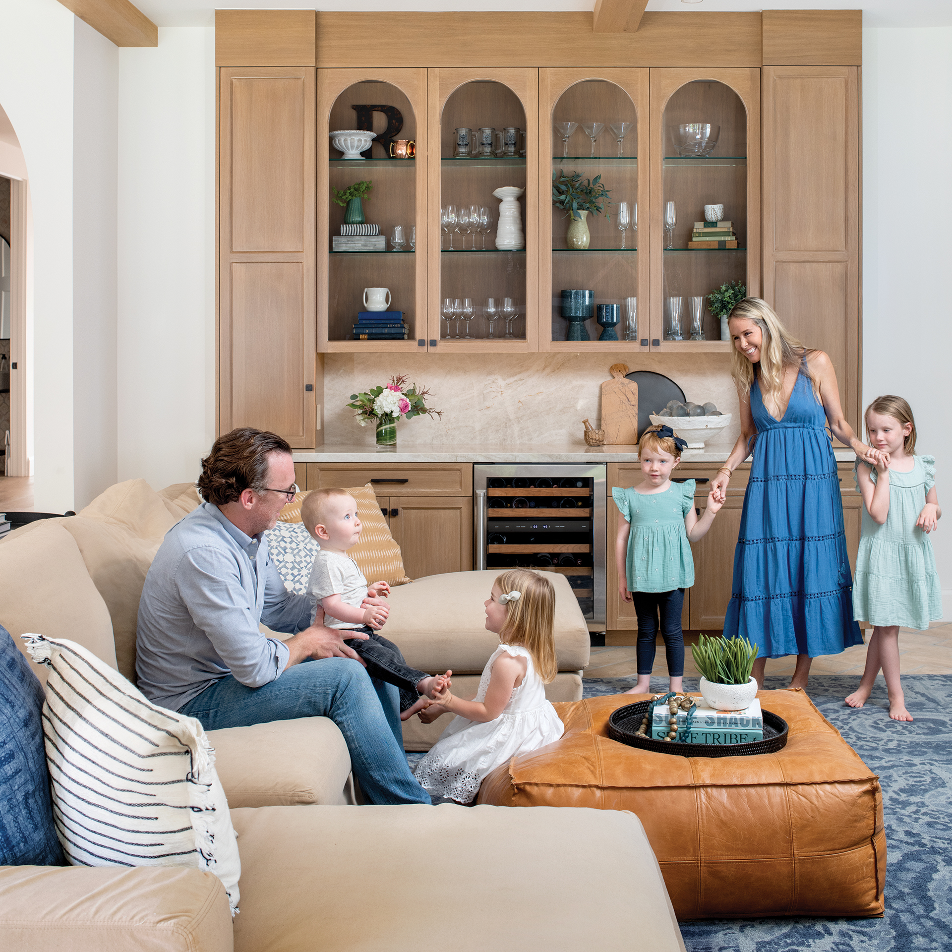
According to Tara, the family’s favorite rooms in the house—the master bedroom and great room—are the results of those efforts, and both open to the outside. “The master bedroom’s opening provides a wonderful breeze when getting ready in the morning, and the great room’s opening makes the backyard and loggia feel like they are still part of the house,” she says. “While cooking in the kitchen or having a drink in the family room, we can see the kids playing in the backyard from every corner of the back of the house.”
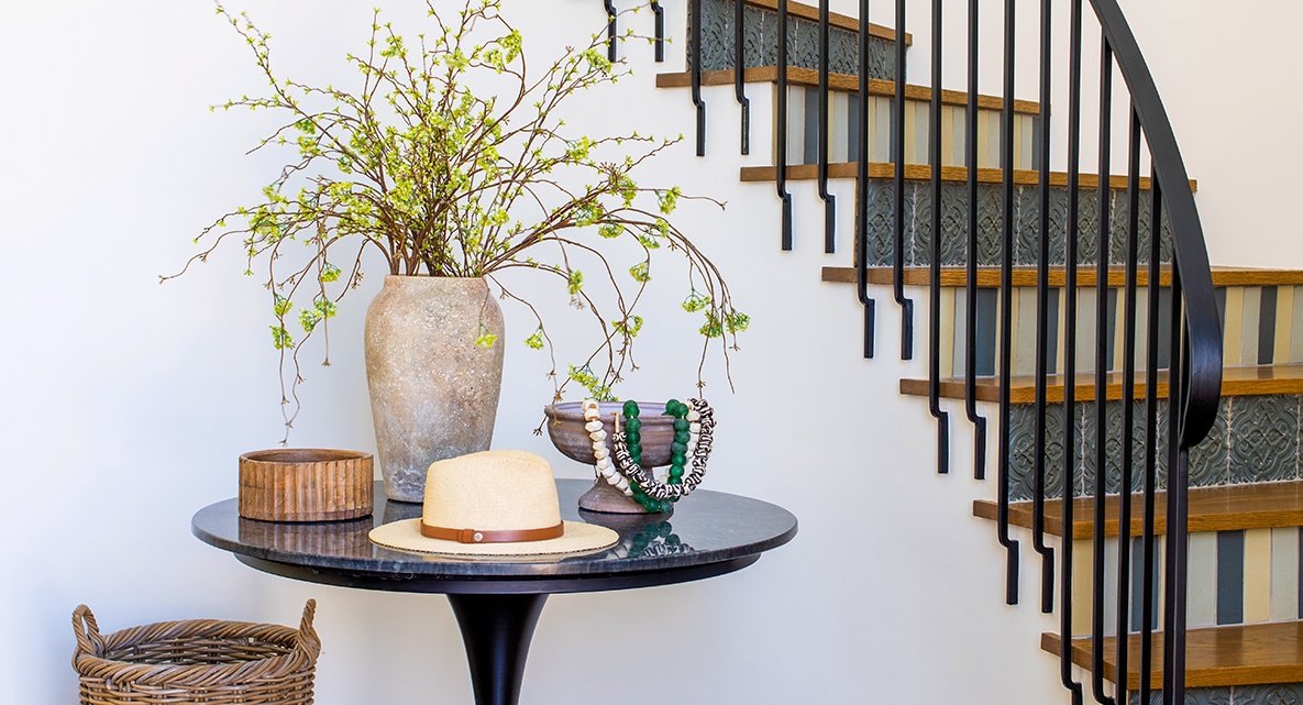
Interior designer Bianca Ecklund rounded out the team and was involved from start to finish. She guided the interior design details during construction and created a soothing color palette of dark blues, sage greens and warm grey to complement the predominantly white, warm neutrals, and terra-cotta materials and finishes. She thoughtfully repeated the use of the palette in every room of the house, beginning with the entry door halo and staircase risers.
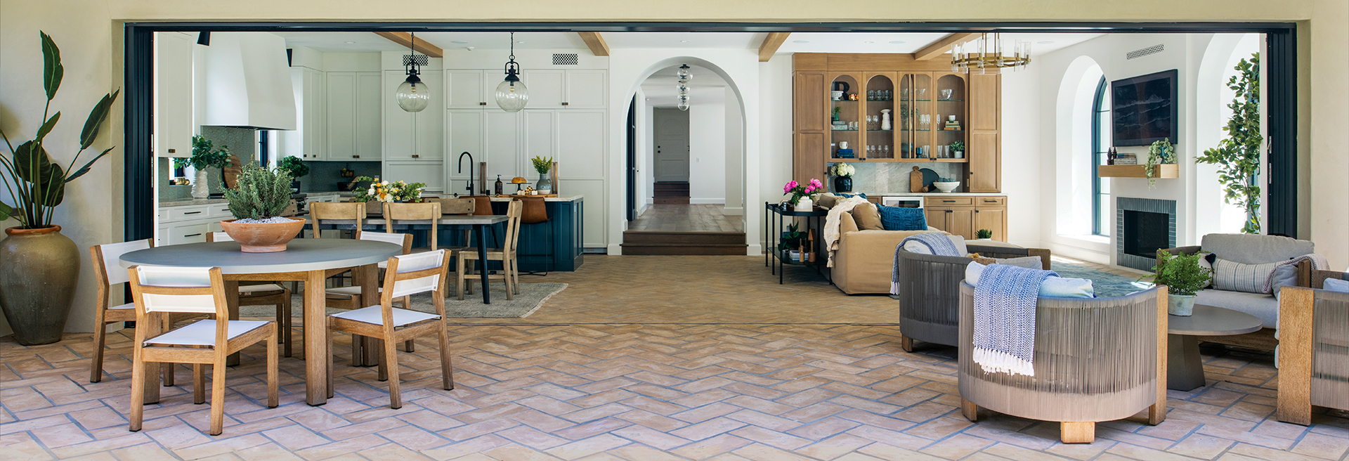
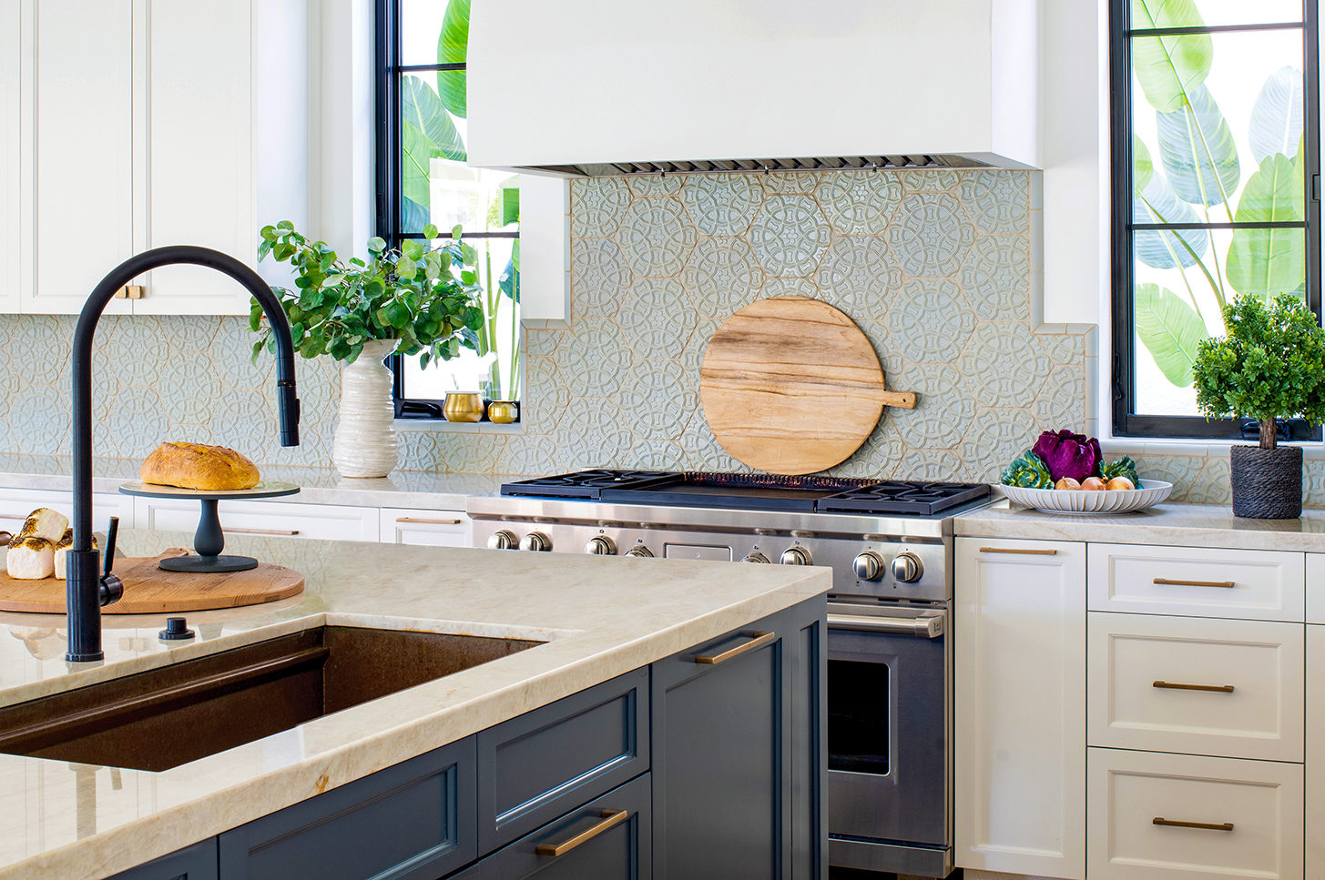
“The clients wanted a dark blue island, so the palette started there,” says Bianca. “Next we selected tiles from BattagliaStile that complemented and played with the island color. Pops of blues and greens were also added to the neutral textural fabric selections. Being kid-friendly was a priority, so I incorporated washable slipcovers and durable fabrics where possible.”
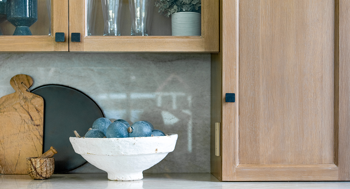
The island was part of the extensive cabinetry throughout the house by Coastal Cabinets, finished in stained white oak and paint. The meticulous workmanship included custom-made ventilation grills built into the upper kitchen cabinets. Smart-home Control4 technology was installed to control the lighting, music, climate and window shades with the touch of a single phone app. Five fireplaces invite cozy conversation indoors and outdoors.
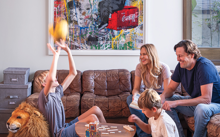
“Our family spends much more time together since remodeling the home,” says Tara. “The living room, kitchen and backyard used to feel like three separate spaces, and we couldn’t see the kids outside when we were inside. Now all three spaces feel like one big room.”


