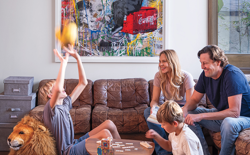
When Mary Beth Christopher, founder and principal designer of MBC Interior Design, and her husband, David, moved to Manhattan Beach from Atlanta five years ago with their two daughters, their search for the perfect home took much longer than they expected.
When Mary Beth Christopher, founder and principal designer of MBC Interior Design, and her husband, David, moved to Manhattan Beach from Atlanta five years ago with their two daughters, their search for the perfect home took much longer than they expected.
“We had been looking for months and not finding the right thing,” recalls Mary Beth, who relocated to the area for David’s job. “This house popped up on my online search, and we called our Realtor about it. She said, ‘Oh, it’s really dark and dated.’ She didn’t think we would like it. We scheduled a visit anyway, and the minute my husband and I walked in, I just knew it was our house. It was a great location, and it had great bones and tons of natural light.”
“It combines our East Coast and West Coast lives and the history of where we have lived and who we are.”
But the original finishes in the 5-bedroom, 5½-bath residence with a salmon pink-hued facade weren’t aligned with Southern California living and its proximity to the ocean. “There were stained doors and cabinets, coffered ceilings and there was brown tile even on the range hood,” explains Mary Beth about the house, which has an upside-down configuration—the kitchen and main living areas are upstairs. “My joke is that all of the light fixtures were something out of Game of Thrones; they looked like they could hurt you. They were primitive and old-world. All of the finishes together gave the home a very specific look.”
Initially the kitchen was outfitted in travertine tile, but there was little cohesion with wood flooring on either side in the living room and family room. “Everything was painted a dark taupe color, and it felt disjointed. The fireplaces had heavy stone, and it all felt very heavy,” says Mary Beth. “But the irony is, I’m actually grateful for those details because it’s those finishes that caused the home to be overlooked by others. It was a diamond in the rough, and it was meant to be our home.”
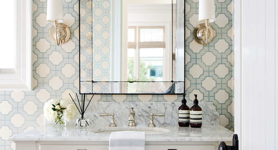
For the 10-month transformation, Mary Beth—originally from Massachusetts—turned to RJ Smith Construction to help with a kitchen remodel; new exterior and interior paint; a full gut of the primary bathroom; refinished French walnut floors; and skim-coating of the walls.
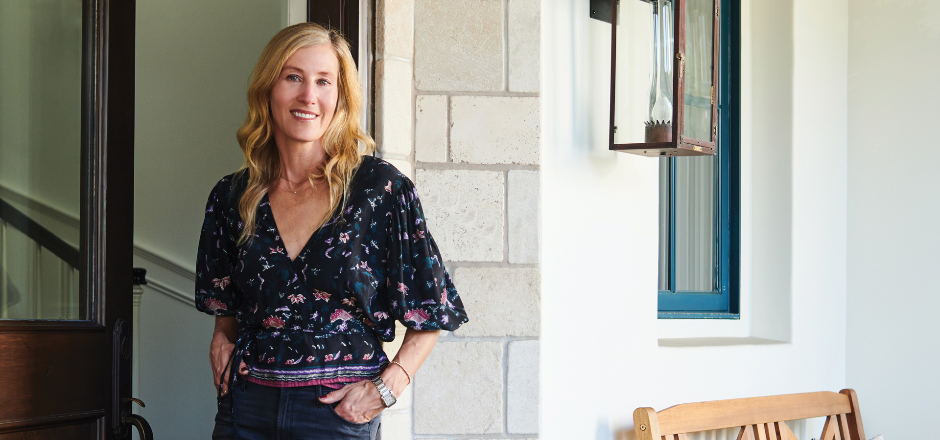
“We got lucky because there are so many Mediterranean homes that have big, heavy concrete balusters and wrought iron curlicue detailing, but none of that was on this house. So that made it feel like a clean exterior and lent itself to be easily modernized. We knew we had to lighten it up with paint; just painting it white made all the difference,” says Mary Beth. “The walls were all muddled textured walls. We went through the process of skim-coating the entire home, which was the most time-consuming. But it’s one of those subtle details that was totally worth it, and I’m so glad we did it.”
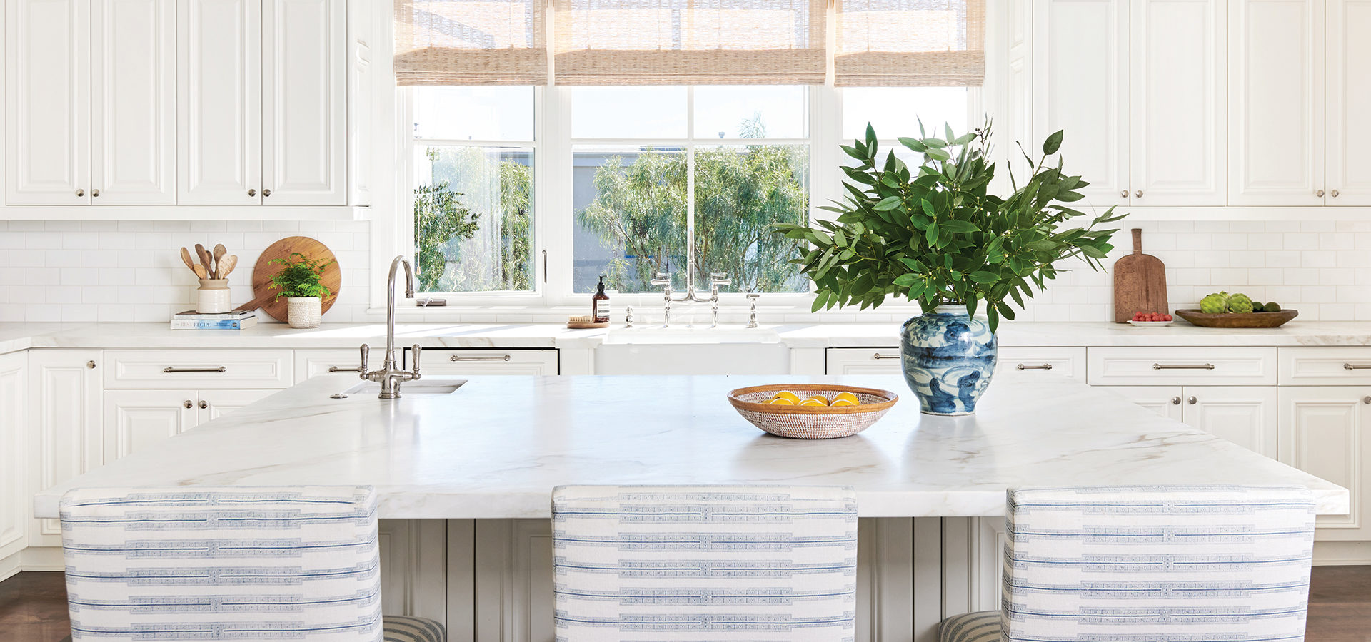
They kept the existing layout and cabinet boxes in the kitchen and replaced cabinet doors and added a breakfast nook and office area. “I never had an all-white kitchen in previous homes, and I always wanted one,” explains Mary Beth, who incorporated color and texture into the space with custom counter stools upholstered in Susan Connor Indro fabric in lake oyster.
She continues: “A white kitchen will always be timeless, and I was trying to figure out a way to make the breakfast room my office but still keep a breakfast nook. It took some convincing, and I saw it right away but second-guessed myself when both my husband and the contractor thought it would feel like it was blocking the walkway into the family room. We finally decided to go for it, and we flanked it with two china cabinets. It feels like a purposeful space that blends in nicely with the rest of the kitchen.”
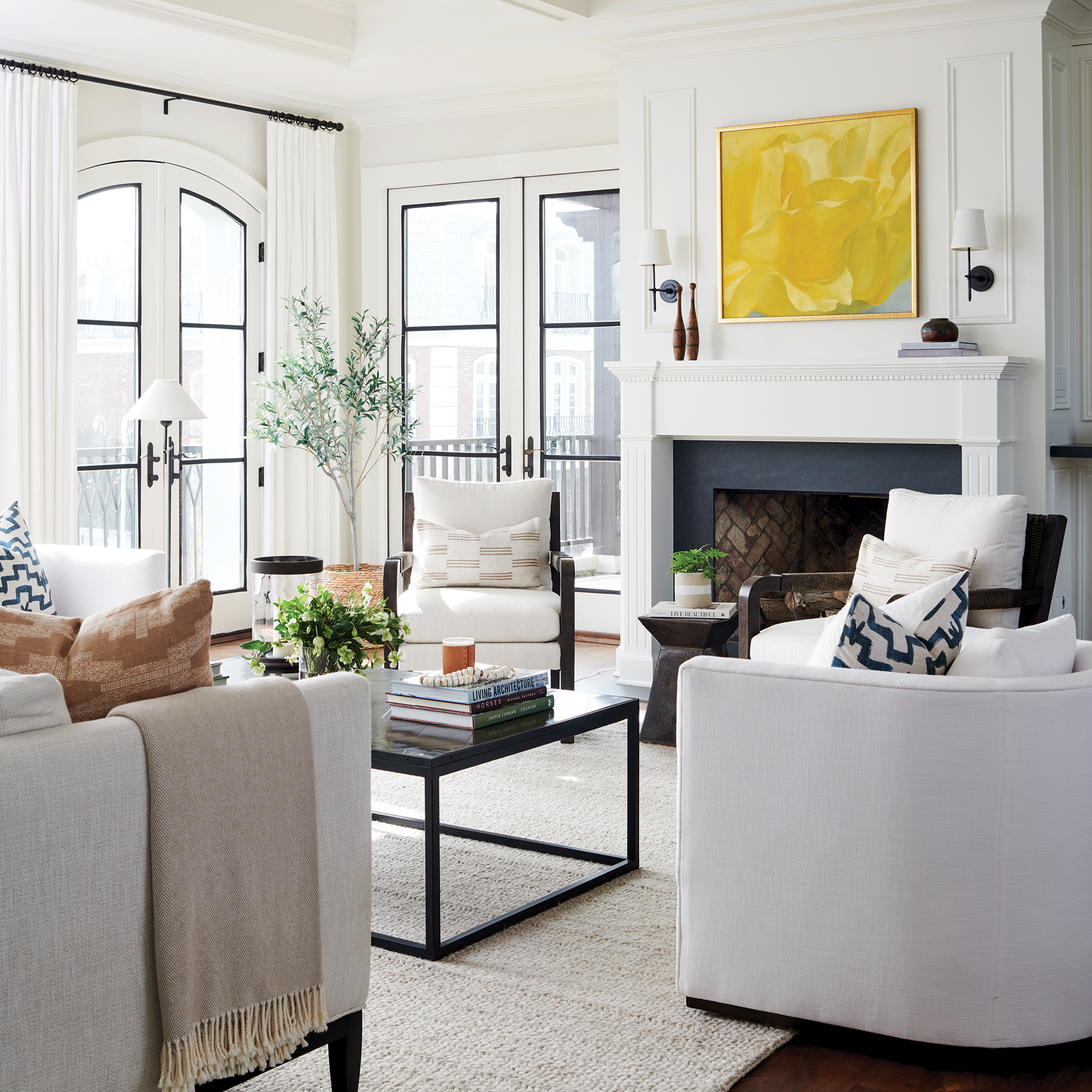
For the adjacent light and airy living room, Mary Beth appointed the space with a rug from Jaipur Living, a pair of Brooks table lamps by Visual Comfort, a metal parquet table from RH and a sofa lined with Perennials’ Whippersnapper fabric in sea salt. A bold yellow abstract original painting by Bert Carpenter hangs above the fireplace.
“It was gifted to David from his grandmother,” shares Mary Beth. “It’s kind of a surprise in there; it sort of goes and doesn’t go. And it has meaning to us.”
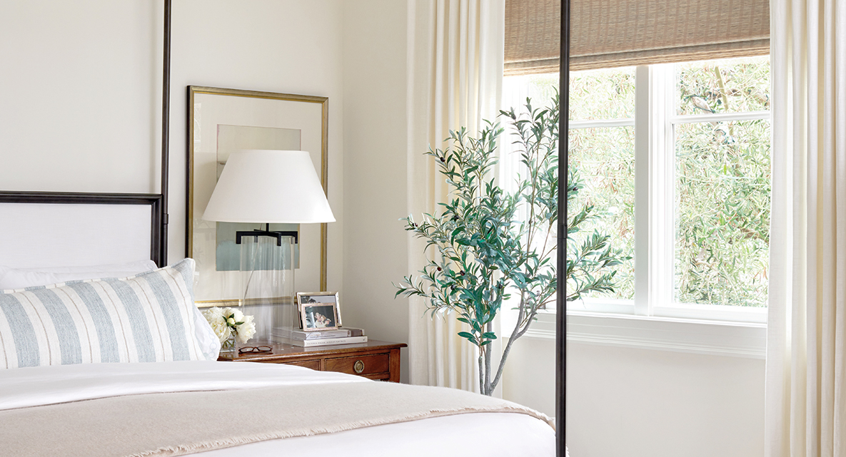
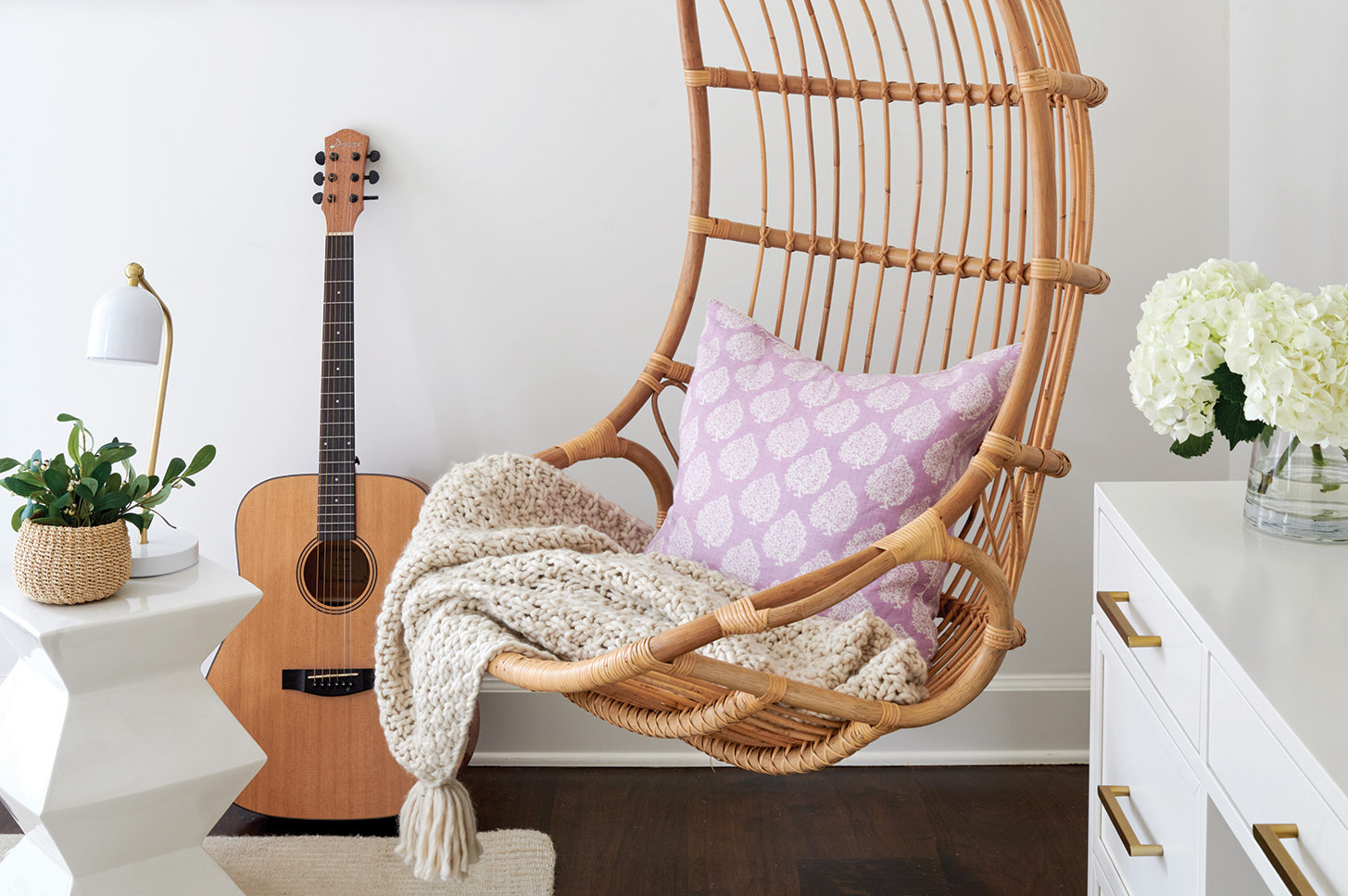
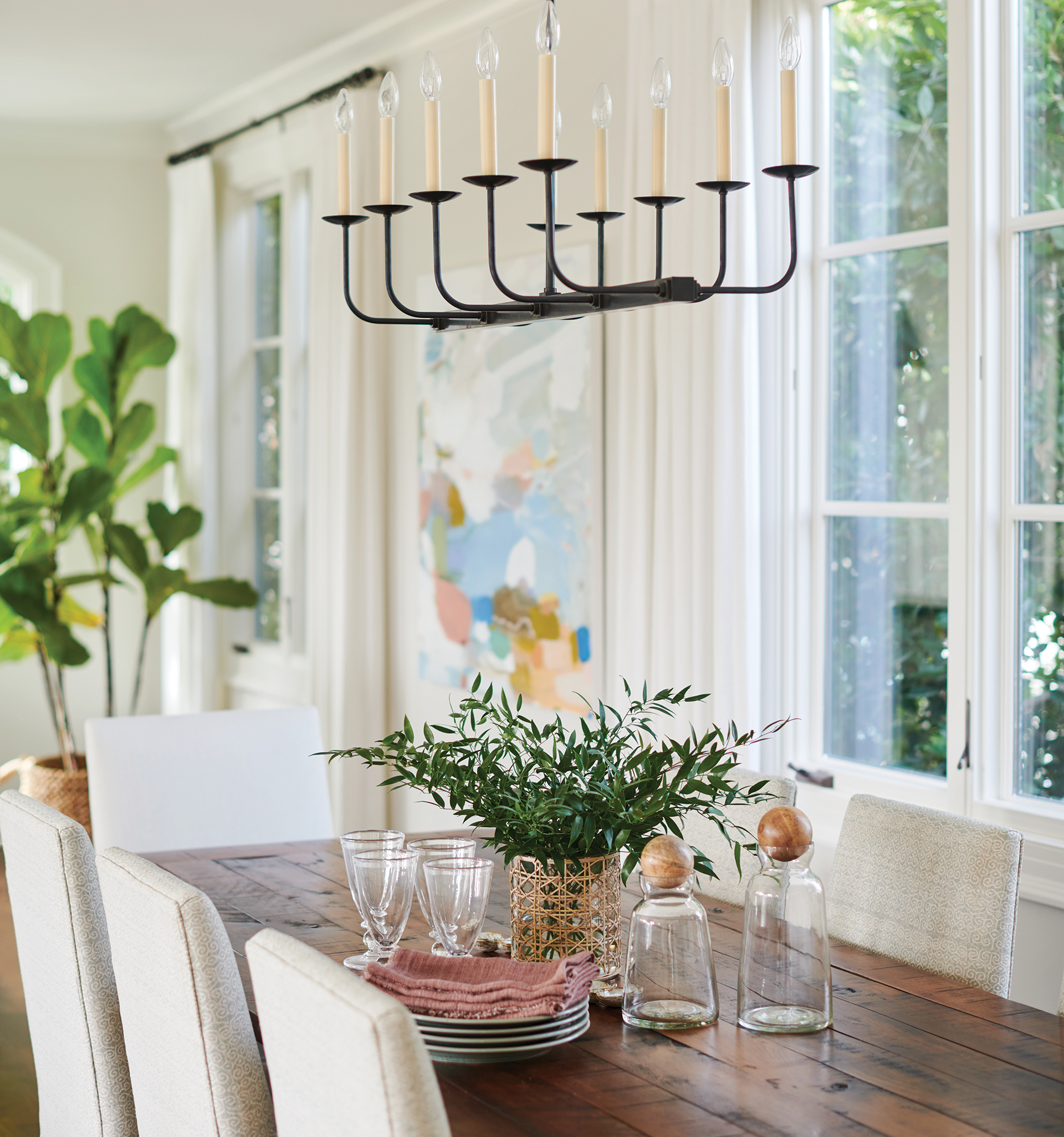
Each room throughout the home has thoughtful and meaningful touches blended with pieces from their previous homes, including their youngest daughter’s bedroom with a rattan hanging chair by Serena & Lily and lavender-hued accent pillows and an accent wall clad in Galbraith & Paul’s Little Lotus wallpaper in phlox. The dining room is home to a reclaimed wood table, a black iron Linear Branched chandelier by Visual Comfort and an abstract painting by Michelle Armas from Gregg Irby Gallery in Atlanta.
“Overall what we did was honor the bones of the home, but I think it still feels like it belongs in L.A.,” explains Mary Beth. “It combines our East Coast and West Coast lives and the history of where we have lived and who we are.”


