When Michigan transplants Eric and Cara Worley moved to California in 2001, they first landed in Huntington Beach and later mid-city. But they yearned for a sense of community for their children, then ages 3 and 5.
“We were living in mid-city Los Angeles, and we didn’t feel like we were really part of the community. And the kids’ friends were all over L.A.,” explains Cara. “We looked at neighborhoods that would give us those things that we felt we were missing, and great public schools was the main criteria.”
Enter Manhattan Beach, where the couple found a Cape Cod-style home in the Hill section in 2008. “We loved the traditional style of the house [we’re from the Midwest and are fairly traditional people], and of course the location,” adds Cara. “We’ve always felt that we had the best spot in Manhattan Beach where we can walk to downtown and the beach. It’s on a quiet little street and has the absolute best view.”
Although they lived in the house for a decade, they’d contemplated reinventing and updating the darker, more traditional space. They realized the house wasn’t exactly what they needed in terms of functionality and style.
“It feels like a retreat or a sanctuary.”
“After 10 years of being there, it didn’t feel like our style anymore and the layout didn’t really work,” recalls Cara, who admits they had grappled with the idea of possibly even moving. “We felt there wasn’t a better place to go. There used to be walls in the kitchen, and the back deck area was much smaller with unusable space. I really wanted it to be opened up and have more kitchen space and more outdoor space. Since we live at the beach, we wanted to make the most of it.”
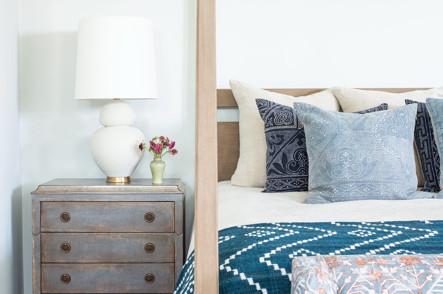
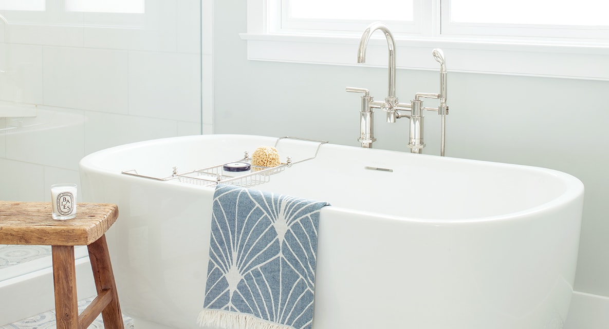
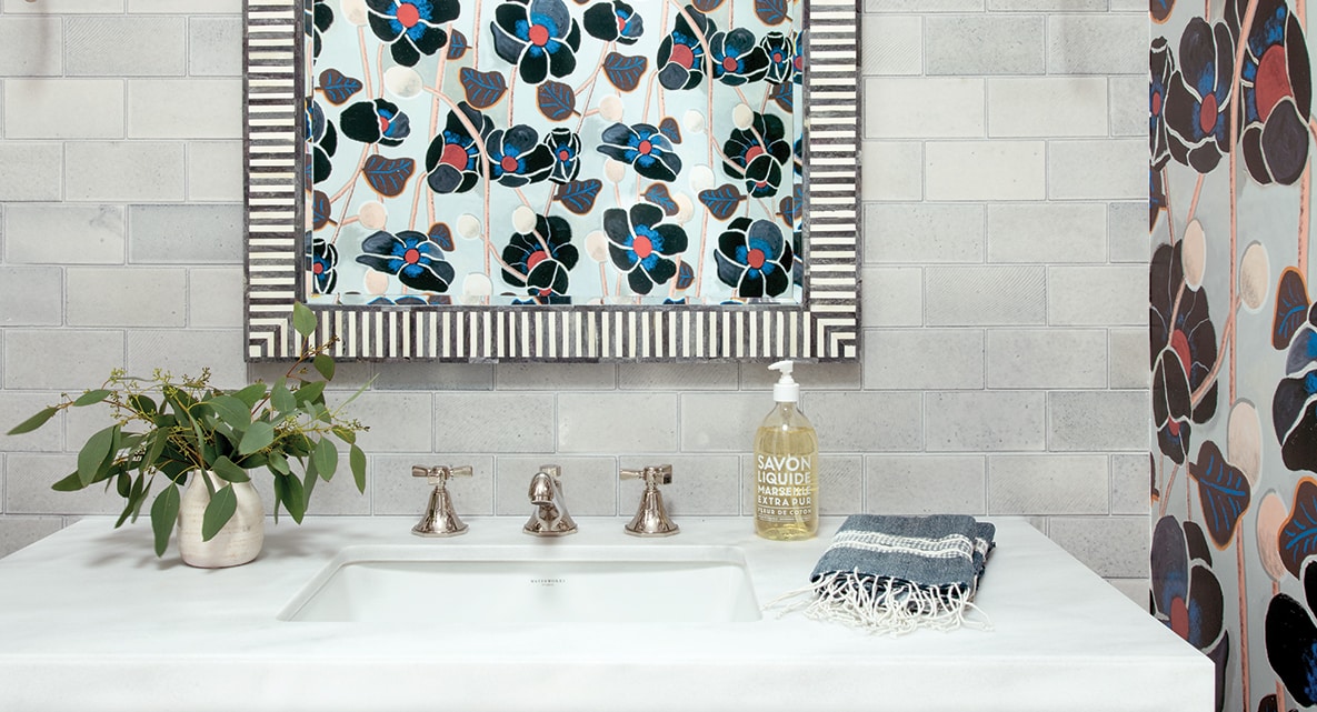
Through local publications and design research, the couple turned to Manhattan Beach–based designer Wendy Word of Wendy Word Design. “We really loved her style and her work, so we met with her and decided to move forward with her,” says Cara. “I basically told her what I wanted to do functionally and showed her a bunch of inspiration that I had been collecting over a long period of time. We wanted to make it more current and brighter and also at the same time create something timeless.”
For the 13-month project that included frequent design meetings with the couple, Wendy and her co-designer Megan Acuna brought on expert collaborators: architect Michael Eserts and Elite Design Builders. “The exterior was a traditional Cape Cod with just a few updates needed [the gates and rails, light fixtures, color and new front door], but the interior was a triple threat: dark, drab and dated,” says Wendy.
She appointed the home with white oak flooring, a calming palette of whites, blues and blacks with contrasting elements, and an artful mix of globally sourced textiles from Africa, China and India. “The Worleys were looking for an easy elegance with sophisticated yet inviting surroundings. The color palette was a strong enough suggestion of a coastal identity, and the finished home reflects this family and its lifestyle.”
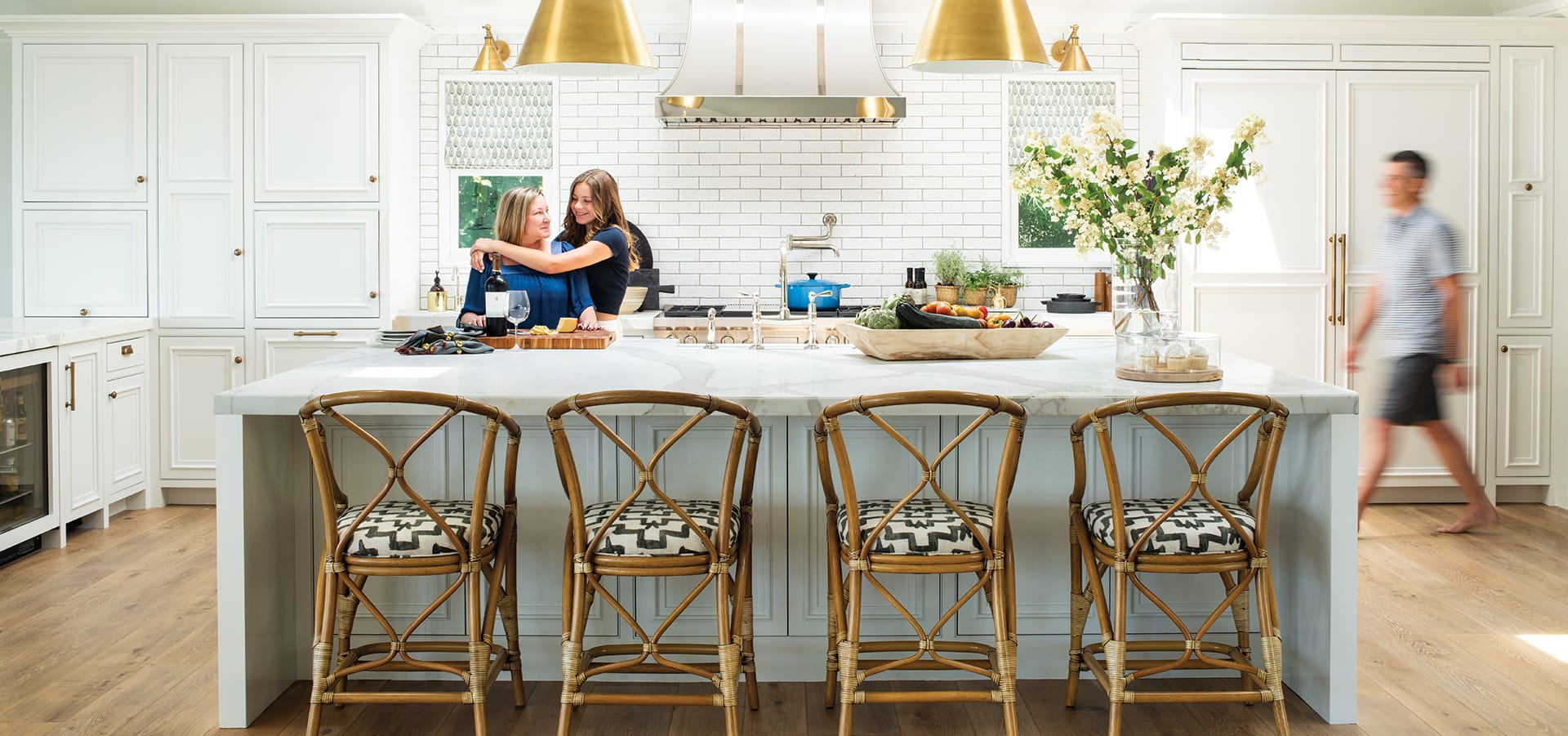
The kitchen, once a disjointed layout lined with pine floors, is now outfitted with clean, bright white cabinets, a backsplash with Grove Brickworks tile by Waterworks and a massive, 10½-foot Calacatta marble island. “It needed to be craned in and hoisted over the deck and installed by an army of guys,” explains Wendy of the team effort to avoid a seam.
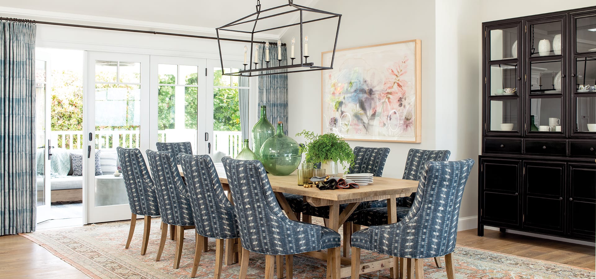
The elegant but approachable dining room features a black hutch, dining chairs upholstered in a shibori-inspired textile, a reclaimed French edition farmhouse table and a vintage Mahal rug. “We wanted to incorporate art pieces that meant something to us,” says Cara. “We included pieces we bought on our honeymoon and a drawing that my aunt made for me [in our office] that’s of our old home where the kids were born.”
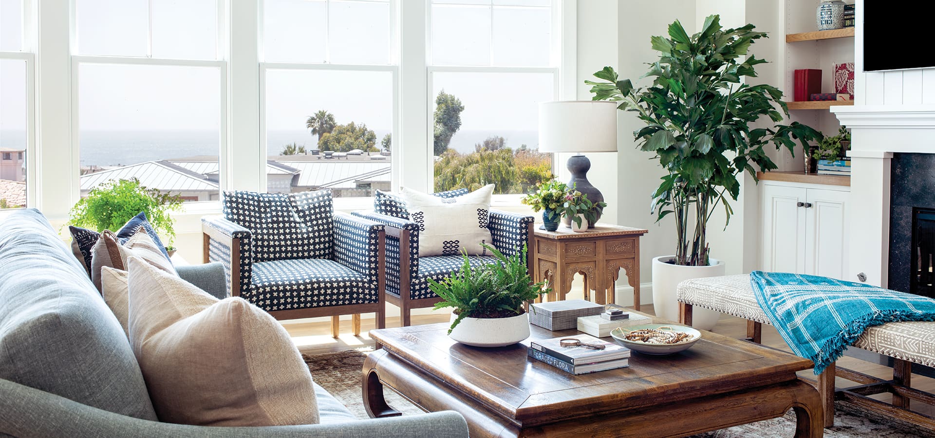
The subtle layering effect continues in the living room, fashioned with an updated fireplace and shelving, and bespoke upholstered pieces in worldly textiles with eye-catching patterns and textures. “They wanted something timeless and lasting but still on-trend, and we tried to find materials that were quiet and easy to be around,” adds Wendy of the room dotted with hints of blue and black. “The ocean views and seclusion are a rare perspective here, and you feel away from the traffic and hustle and bustle of the city. But you still have all of the benefits, so it feels like a retreat or a sanctuary.”
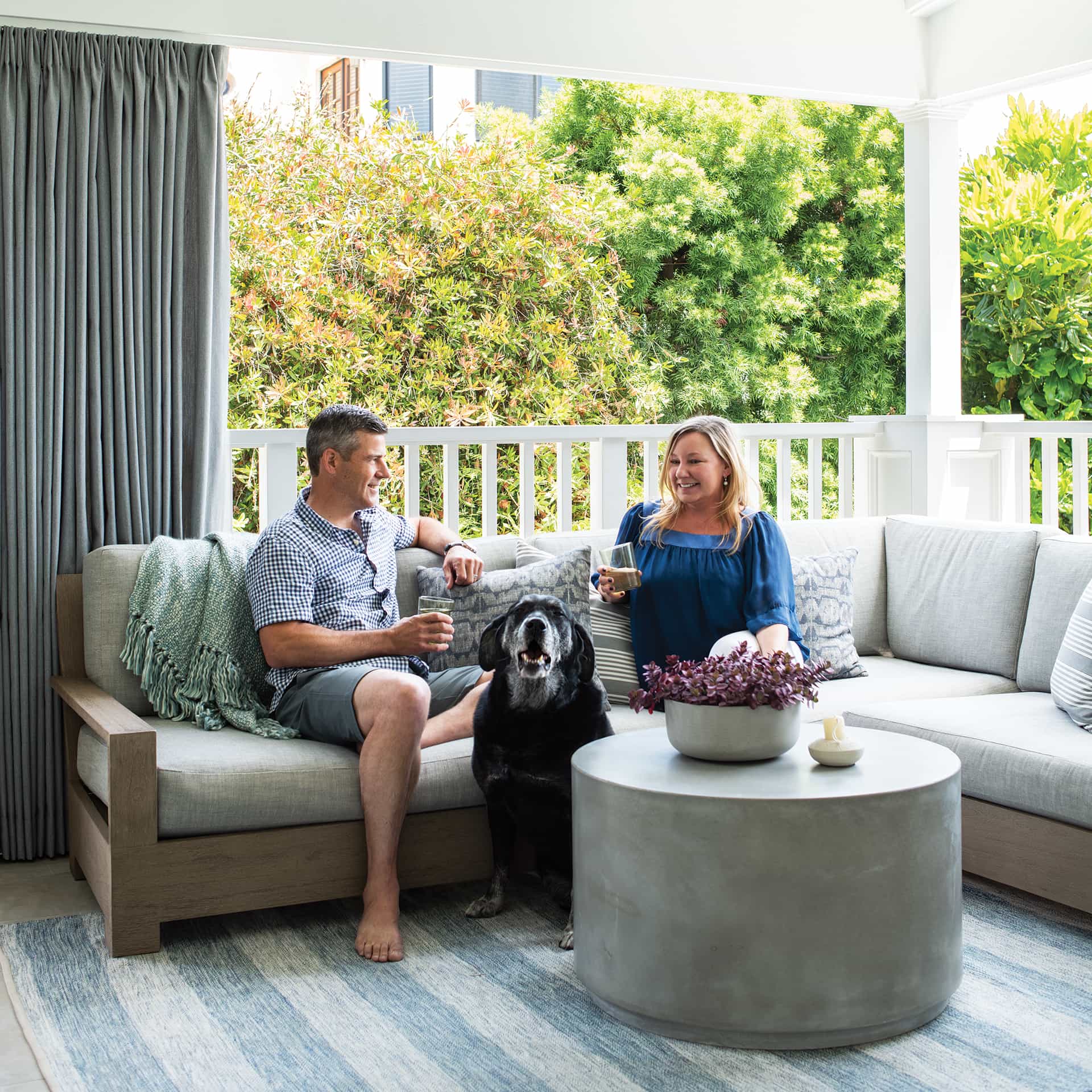
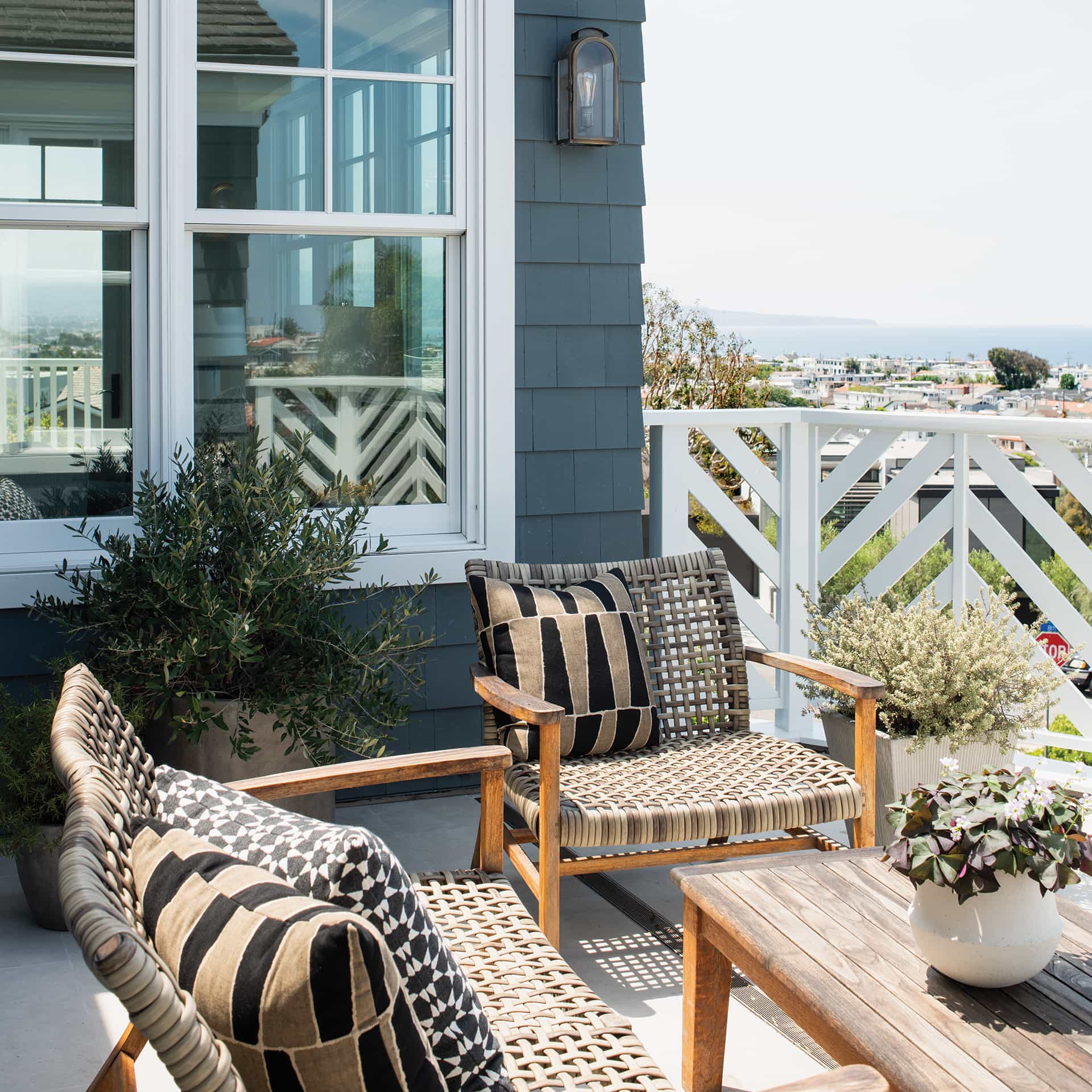
The exterior design was also a major priority, so much so that they allocated approximately 500 square feet of the overall square footage to create a new designated space for lounging, entertaining and dining. “We absolutely love this space,” adds Cara of the refreshed area that she enjoys with Eric, their son and daughter, and the family’s black Labrador retriever, Buddy.
The outdoor living space boasts custom teak built-ins and barbecue area, a seating zone with a sectional from Restoration Hardware, an outdoor rug from The Rug Company and a new proper staircase. “Before, the way it was laid out, it was a very small, unusable space,” explains Cara. “We wanted to have more outdoor space, so we actually ended up taking some of the interior square footage and making it outdoor space.”
All settled back in, the Worleys feel right at home with timeless results. “It just feels so good,” says Cara. “It’s so happy.”
Southbay Shopping Guide
Shop local! As fall comes into view, we look to our retailers for inspiring seasonal style. Get to know some local destinations and preview a handful of their latest arrivals.


