Their remodel is so unique, it stops traffic. Four surfaces comprise the exterior of the home. And the interior is just as compelling. It’s a space that reflects the couple’s shared aesthetic, a desire for functionality and beautiful materials. A modern design has transformed a house in need of an update into a distinctive nod to the future.
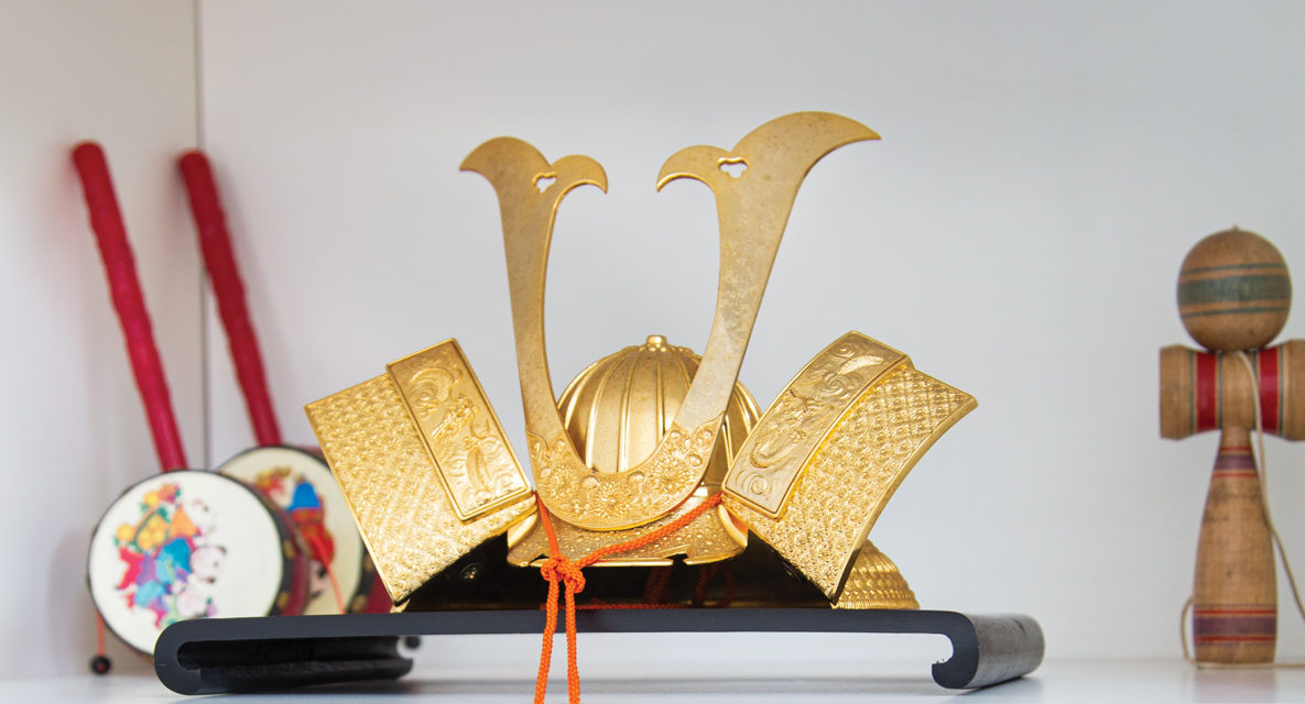
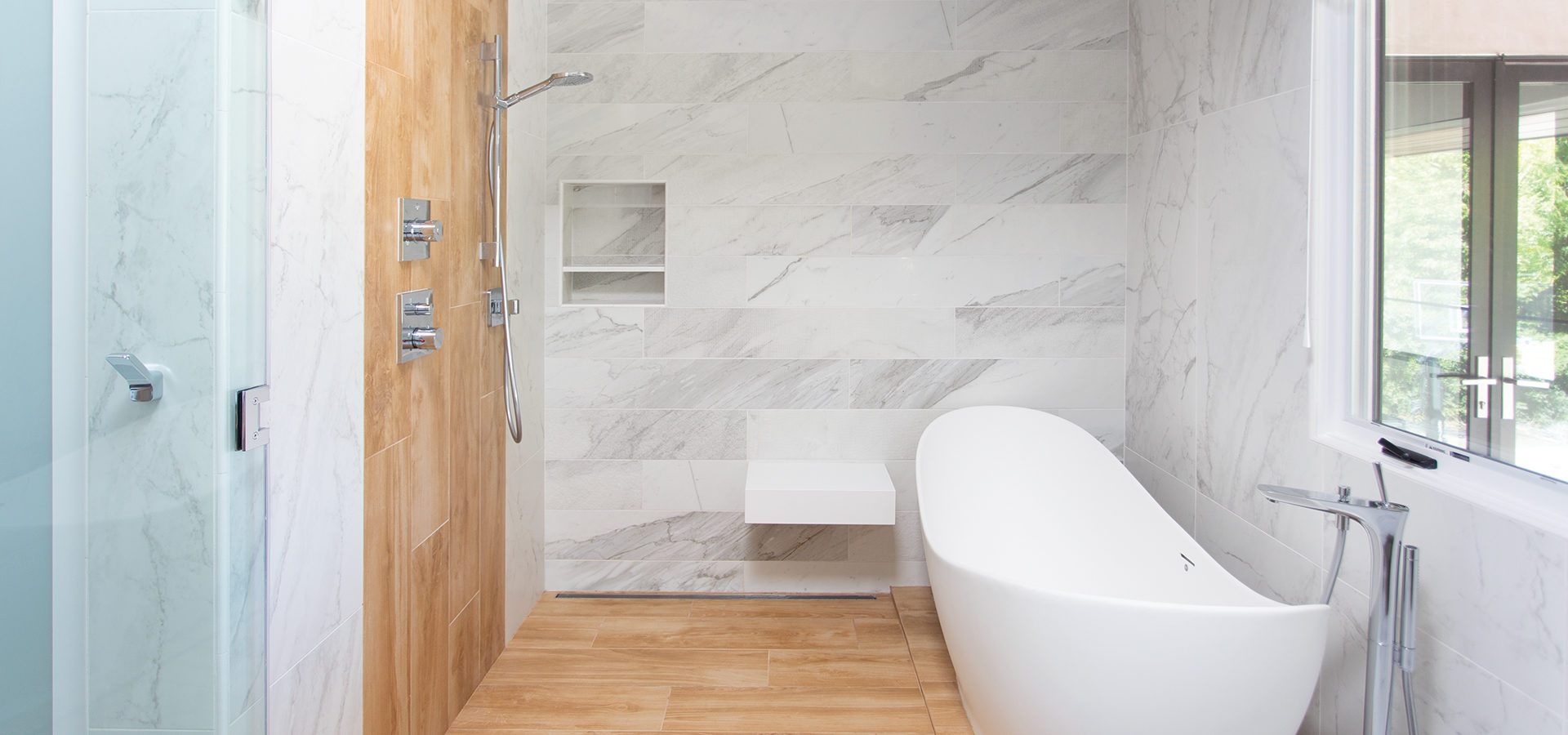
The homeowners are both of Asian heritage and wanted that aesthetic at the heart of their home. They were also united in their love of clean, simple lines and wood finishes. There are cultural touches throughout: a custom-made shoe cabinet for the entry, a Japanese-inspired spa-like master suite bathroom and a prominently displayed butsudan (a traditional Buddhist altar).
A unifying element to the overall design is the use of low-maintenance, high-end porcelain tile. On the exterior, tile that looks like wood gives the home a contemporary touch, while stone and stucco echo the original façade. Crowning the structure is a handsome metal roof (one of only three in the neighborhood). An update of this scale was a challenge that their architect, Keith Johnson, designer, Diane Barber, and contractor, Norman MacKnight, were ready to undertake.
“It’s a space that reflects the couple’s shared aesthetic, a desire for functionality and beautiful materials.”
Keith, of Pritzkat & Johnson Architects, was excited by the prospect of creating a singular look to the house. Although the owners had done a small remodel when they purchased the property in 2011, they knew they would eventually overhaul it. The house was taken down to the studs. Walls were removed and ceilings were vaulted to create an open concept.
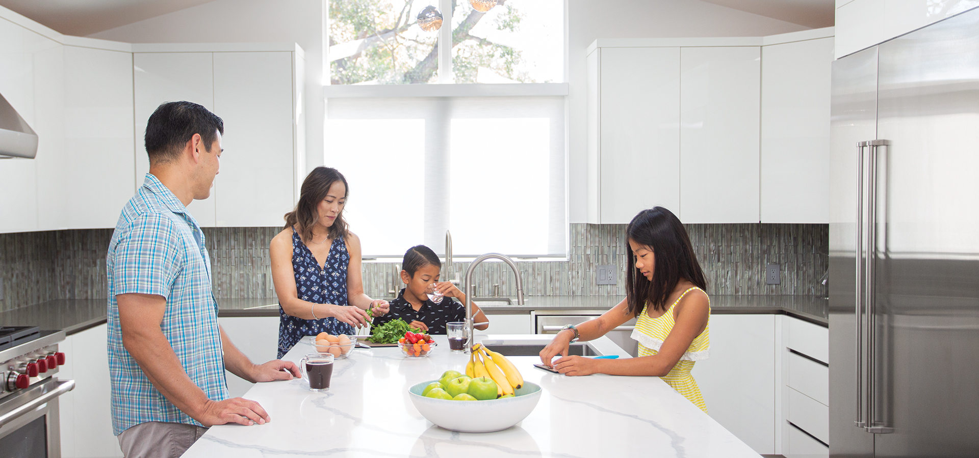
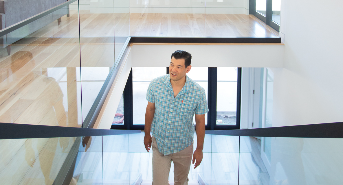
The wife says, “(What) we love most about the remodel is the reconfiguration of the common areas. The kitchen flows into the dining room, which then flows into the living room area. We also love how bright, open and airy the house is.”
Keith is pleased with their success and notes, “Taking an idea and transforming it into an amazing, actual livable space is very rewarding—when we hear how much family and friends love their house, how neighbors and passersby love the architecture.”
During the years that led up to the remodel, the homeowners were thoughtfully developing their design wish list. When they started working with designer Diane Barber, she was able to translate their vision. “It was very rewarding for me when the owners saw the final results and exclaimed, ‘It looks just like your design drawings!’” notes Diane, who also credits the MacKnight construction team and BattagliaStile for helping the couple realize their new home.
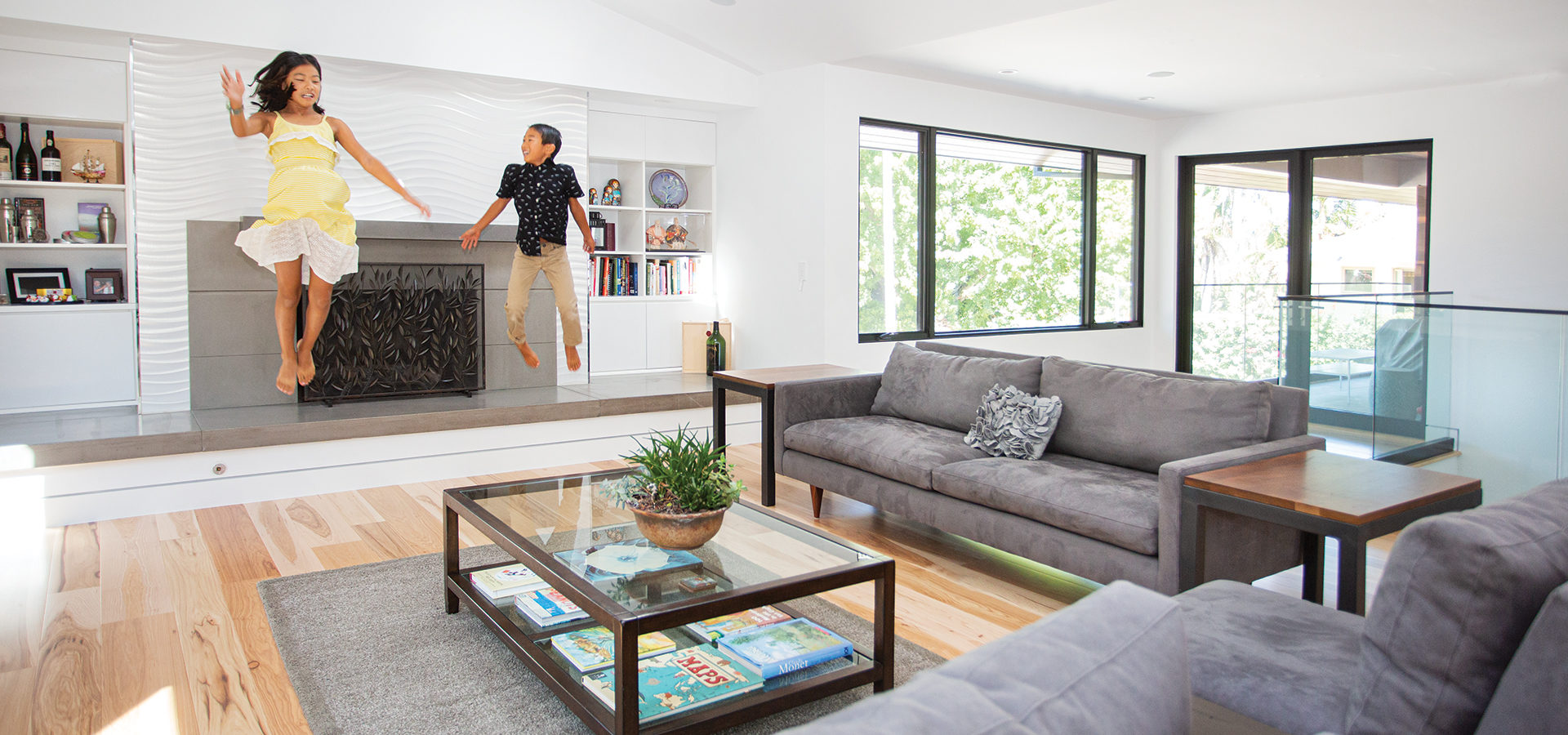
The wife shares that her husband was very involved with the design process—“down to the details of where he wanted outlets and light placement. He designed the cabinets and library for the kids, had specific ideas for the master bath, designed the wine closet and researched the various fireplace units.”
While he was very active in technical aspects of the design, Diane enhanced each space by providing design selections that elevated the couple’s original ideas. In fact, when the homeowners talk about their “Spartan bathroom” (they initially wanted it to be utilitarian with no special finishes), they laugh and say that if it were up to them, they would have chosen a white toilet, white sink and white bathtub.

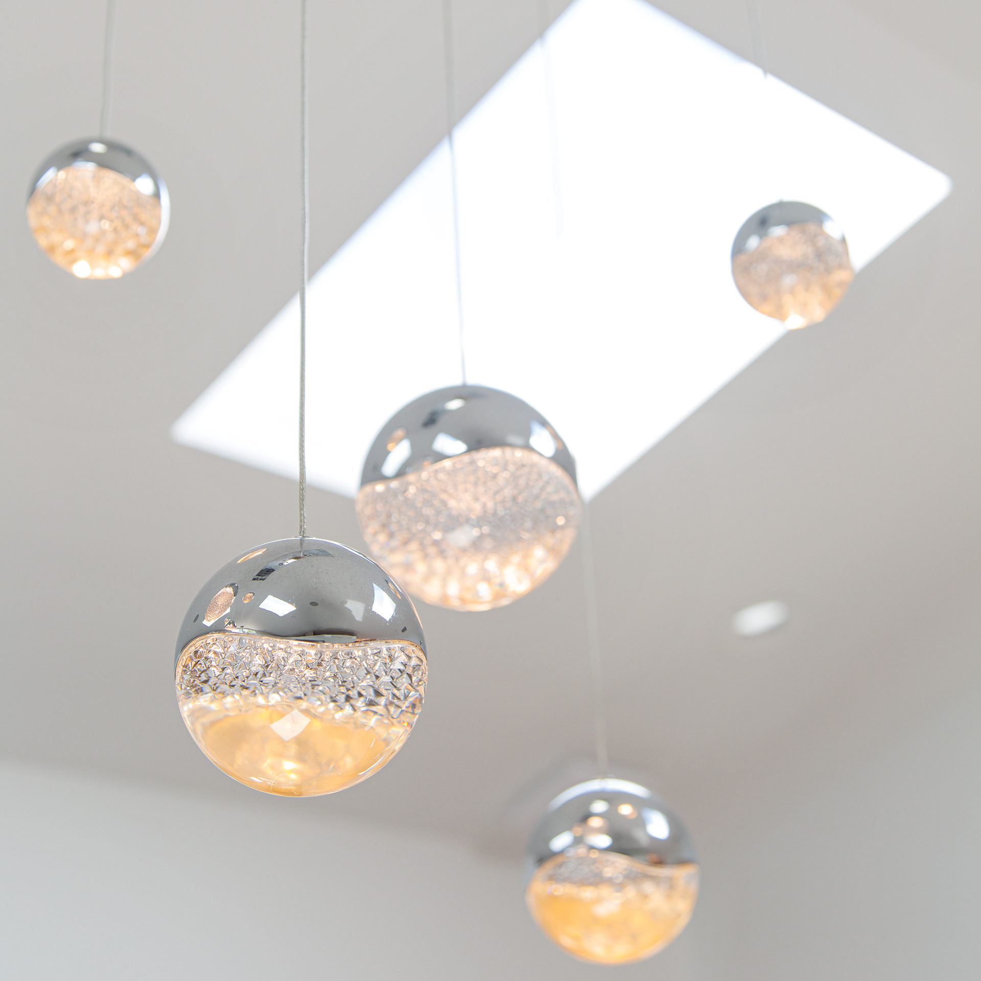
She shares, “Diane came up with some great design ideas for the bathroom, including a really beautiful tile. Diane also selected some light fixtures that perfectly matched the aesthetic of the bathroom. The ‘Spartan bathroom’ ended up being one of our favorite bathrooms in the house.”
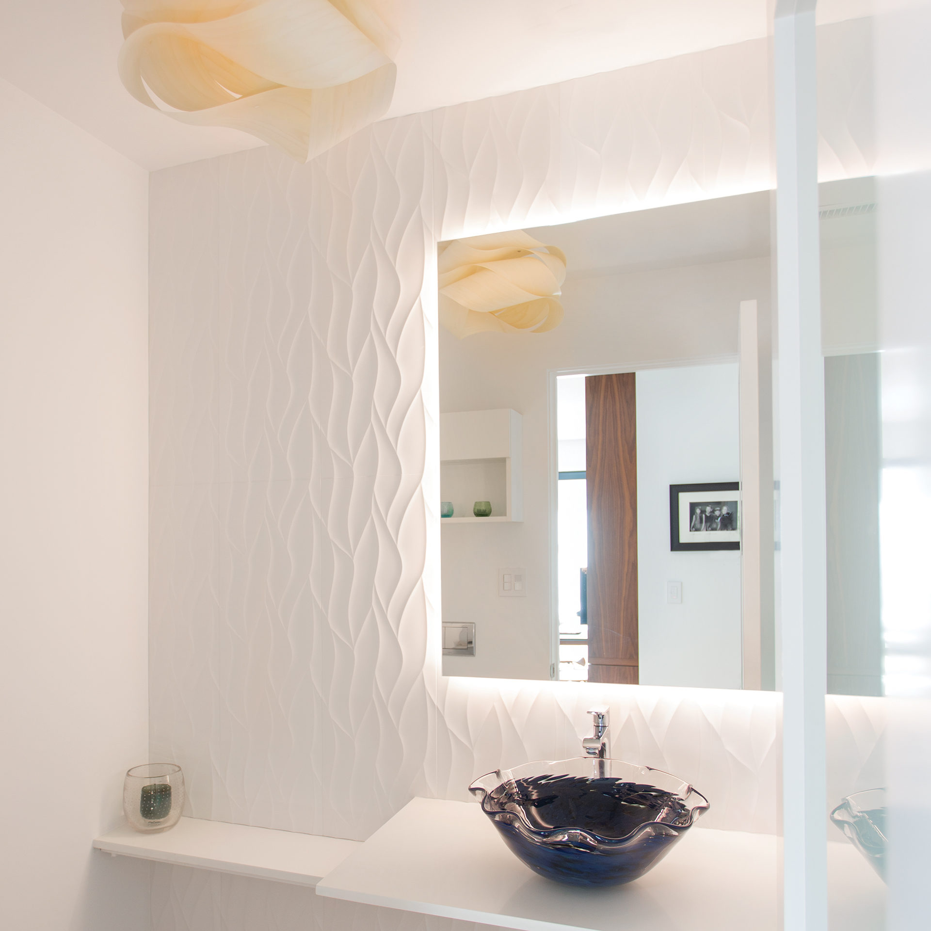
A colorful glass sink against a wavy porcelain wall tile makes the powder room inviting and serene. The Asian-inspired wooden lantern from Spain amplifies the simple elegance of the space.
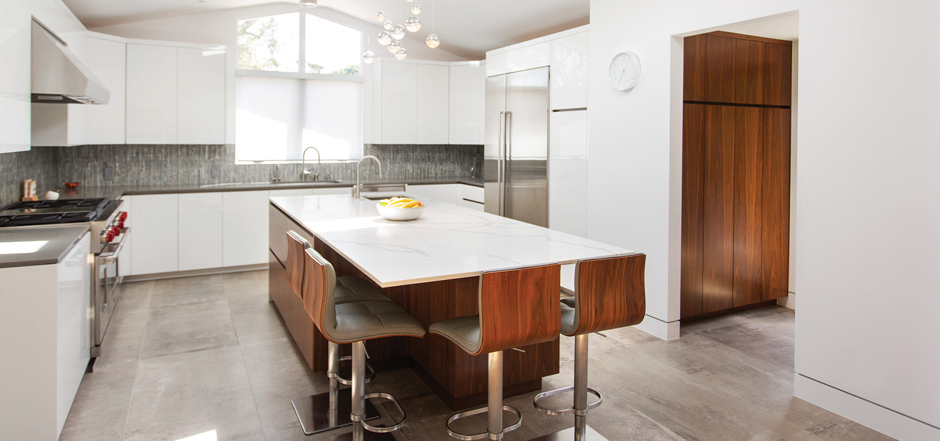
However, with children, family visits and pool time, the house also needed to be made of durable materials beyond sturdy tile and quartz countertops. Custom-milled, wide-plank hickory floors were installed, and their favorite wood—walnut—was selected for cabinetry and accents. The couple was surprised by how resilient the floors are and appreciate the visual lightness they provide. His Life Woodworks built all of the streamlined cabinetry, including the stunning kitchen with a high-gloss, white piano finish that adds to the clean, airy aesthetic of the home.
Keith, Diane and Norman have worked extensively in Palos Verdes and knew this house was a special project. The home’s carefully curated materials were selected to be environmentally friendly, and the latest in-home technology ensures a sustainable use of energy. Along with the open floor plan and modern sensibility, the home represents a new style in the neighborhood. Homeowners want fewer walls and a spatial flow that encourages family time—and, sometimes, a way to make what’s old new again.
Holiday Wish List 2024
Our annual holiday gift guide highlights the latest trends in fashion, jewelry and home goods available at local retailers for all of your gifting needs. Don’t let the season’s best and brightest pass you by!


