A Manhattan Beach couple creates a light-and-airy retreat with layers of pattern and pops of color
It was all about timing.
- CategoryHomes
- Written byJennie Nunn
- Photographed byKristin Anderson
When it came to finding their home in the Tree Section in Manhattan Beach, Judy and Stephen Bay were literally in the wrong place at the right time. “We went to the wrong house on the day of the showing, and it wasn’t originally the house we wanted to see,” explains Judy of the fortuitous mishap. “We asked to see a different house, but our broker found this house and we fell in love with it.”
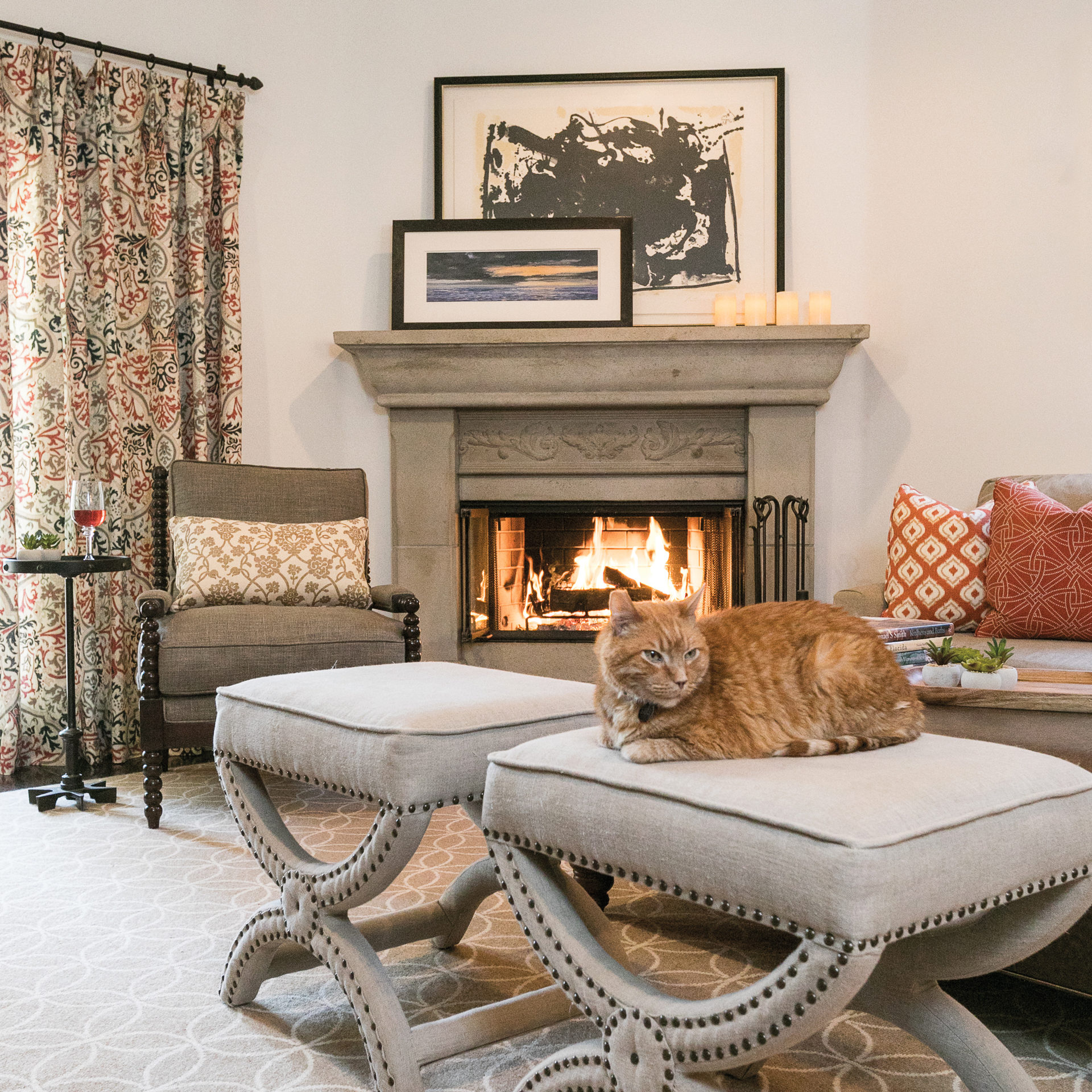
“It had a really, really nice feel to it,” adds Stephen of the 5-bedroom, 4½-bath residence on a 5,000-square-foot lot. “We walked in, and we thought, ‘It has everything we were looking for.”
“If a client owns pieces they love and they work with the design direction, by all means I want to use them. It really adds to the personality and brings depth.”
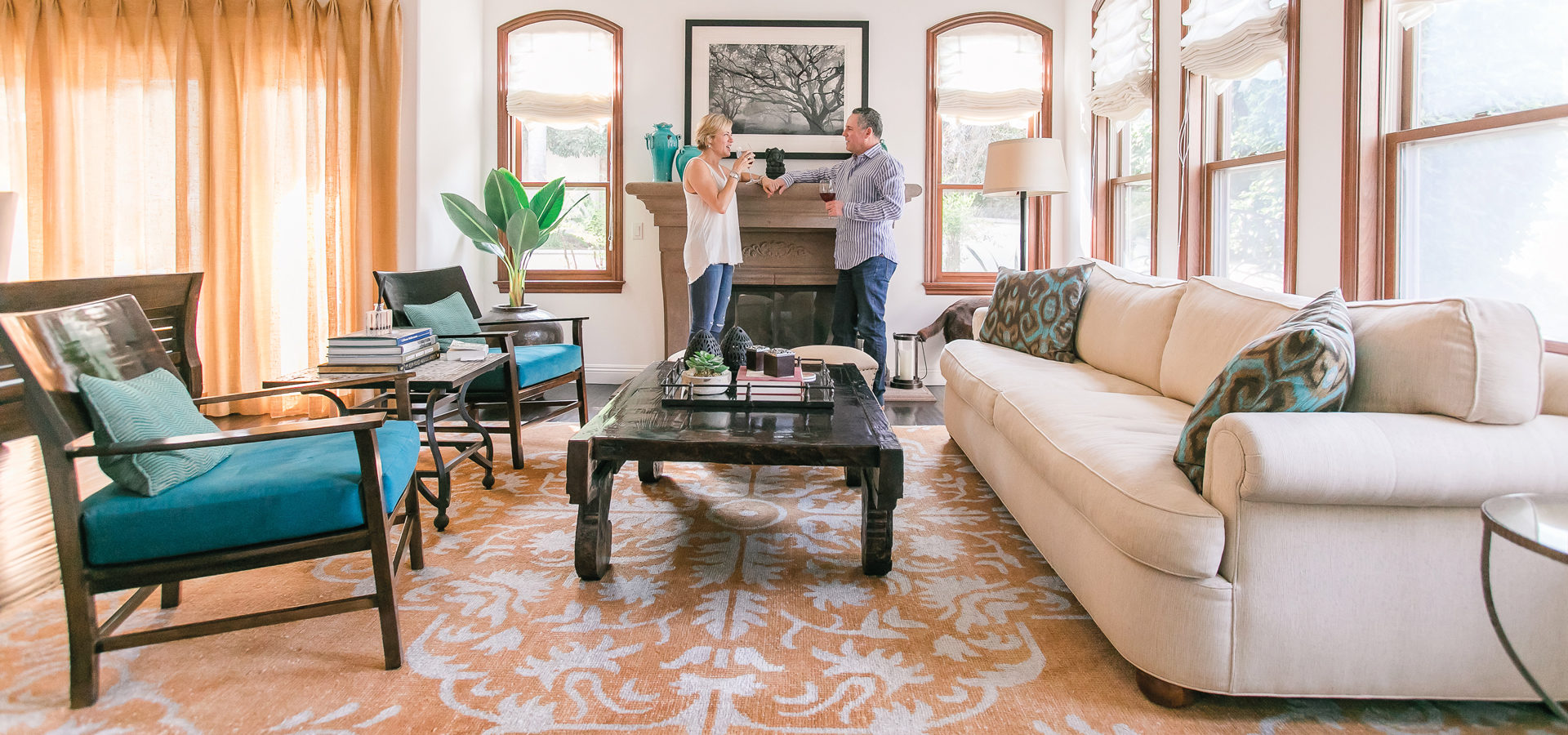
The existing two-story home, though, was not quite the style they wanted. “It’s a very lovely Mediterranean-style house, but it had burnt orange walls, blonde wood floors and heavy drapery—and it was a bit formal for us,” recounts Judy. “We wanted it to showcase a lot of our artwork, and we wanted the walls to be a lighter color. Stephen is a big cook; we didn’t feel like the existing layout of the kitchen was working.”
Over the years the couple put their own stamp on the house they once shared with their two children (now grown), their cat, Gus, and chocolate Labrador retriever, Harlan, in several design phases. “We basically redid everything with the exception of the laundry room and a little sofa at the top of the landing on the stairs,” says Stephen.
To combat the dark feel of the home, Judy chose a crisp white paint—Simply White by Benjamin Moore—for the common areas and Natural Linen by Benjamin Moore for the master bedroom. “I like color that’s easy to transition out,” she adds.
Judy selected a few pieces for the kitchen, master bedroom and living room from HomeGoods, Houzz, Pottery Barn and Frontgate and had some reupholstered in designer fabrics. “I like to add pops of color through curtains and pillows so it’s easy to change.”
For the kitchen redesign, the couple turned to contractor Tom Rochford and designer Josette Murphy, principal of About:Space, LLC in El Segundo, who was a referral from a friend. Josette was also later hired to help with the adjacent breakfast room and den, living room, and master bedroom and bathroom.
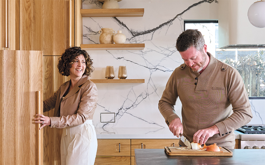
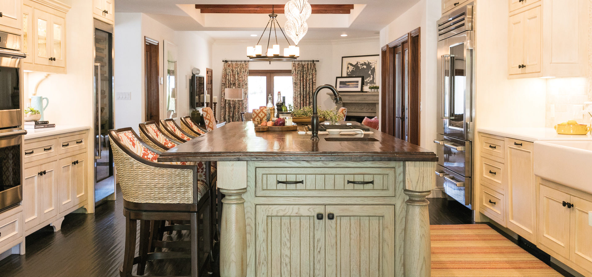
“The kitchen was dated and with very traditional styling and rather 1980s clipped corners and granite counters,” says Josette of the kitchen lined with custom cabinets by Benjamin Gordon of Gordon Woodcraft; an island countertop custom-made in solid plank walnut; a Francis multicolored wool rug from Contempo Floor Coverings; and Sheldon swivel counter stools from Frontgate recovered in Gostwick Park by Zimmer + Rohde and treated with a laminate for easy cleanup.
“The layout didn’t change that much, but we completely gutted it and wanted to lighten it all up,” says Josette. “We distressed the island in an olive green color wash to look like a piece of furniture. The Omar blown-glass pendants by Currey & Company are mouth-blown and had this old Spanish vibe. They had some rustic, hand-painted Italian dishes that they wanted to display in the cabinets, and they wanted a place for easy access to cookbooks.”
They also removed an unsightly existing blonde wood overhang and replaced it with beams, a perimeter soffit and new lighting. “We designed and stained the new wood ceiling beams to match the beams in the adjacent breakfast room so they looked original,” she adds.
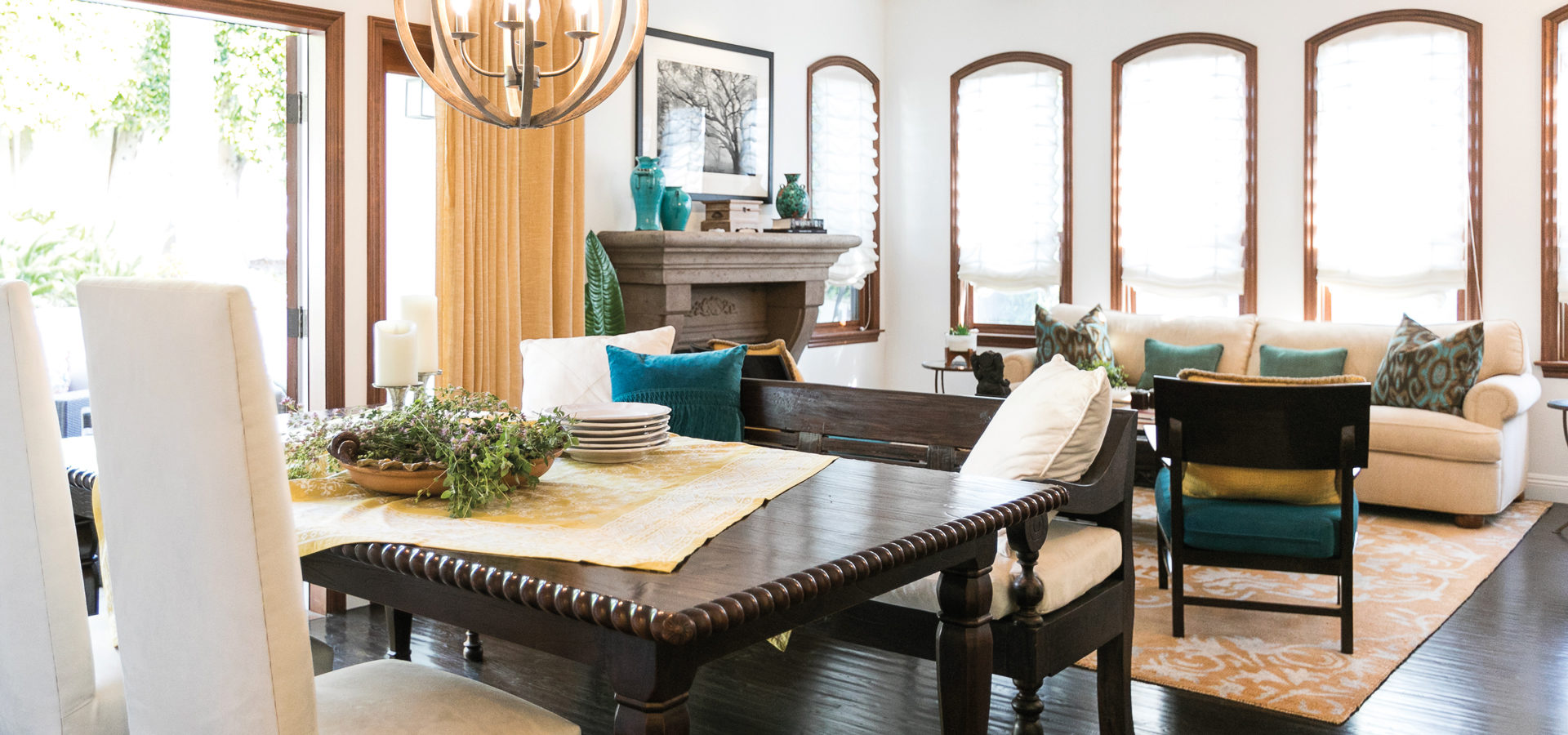
In the adjacent breakfast room, Josette used the couple’s own dining table and added a burst of color with tangerine-hued slipcovers for the four chairs made from Magnolia Fabrics. “We also added an area rug to soften the space,” she says. “The fabric was chosen to complement the island stools and the family room pillows and window coverings so that all three connected spaces had a similar feel.”
In the den/family room area, Josette combined existing window coverings and a few of Judy’s own orange-and-cream printed pillows atop a neutral sofa to dictate the color palette, along with custom red pillows with a cream pattern in Schumacher’s Durance fabric in Bittersweet. “There’s a lot of different palettes, but by staying in a tight color range they complement each other and create interest and harmony,” she says of the pattern-on-pattern look. “Layering multiple patterns works best when you start with a more neutral ‘ground’ and keep the large elements visually quiet [like sectional, rugs, cabinets] so the eye has a place to rest too.”
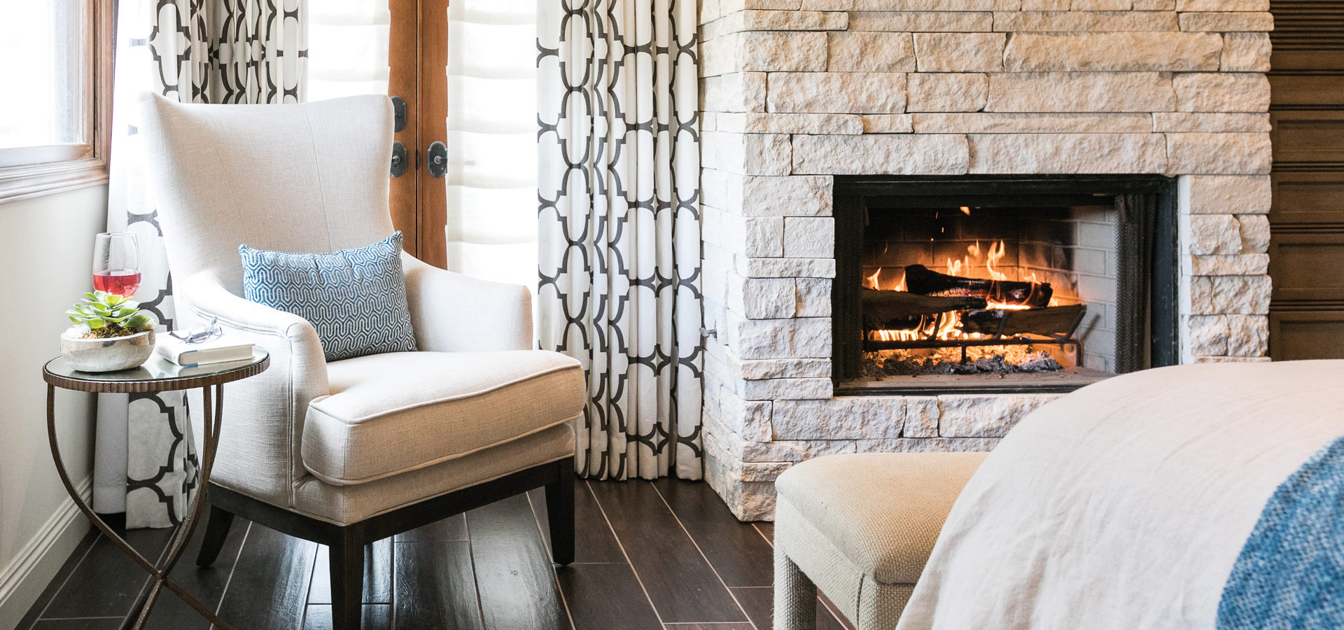
Upstairs in the master bedroom and bath, Josette—with the help of contractor Eric Friske—created the ultimate resort-like sanctuary. The master suite is awash in a textural cream and dark brown base with hints of pale indigo and butterscotch. The taupe headboard was reupholstered in Overton fabric by Pindler & Pindler, while two Sunset Point nightstands by Hooker Furniture flank the bed.
“I’m not afraid to work with what the client already has and carry the client’s personal history through,” says Josette of using Judy and Stephen’s own pieces, including a wingchair from HomeGoods. “If a client owns pieces they love and they work with the design direction, by all means I want to use them. It really adds to the personality and brings depth. There is nothing worse than buying everything new from the same resource.”
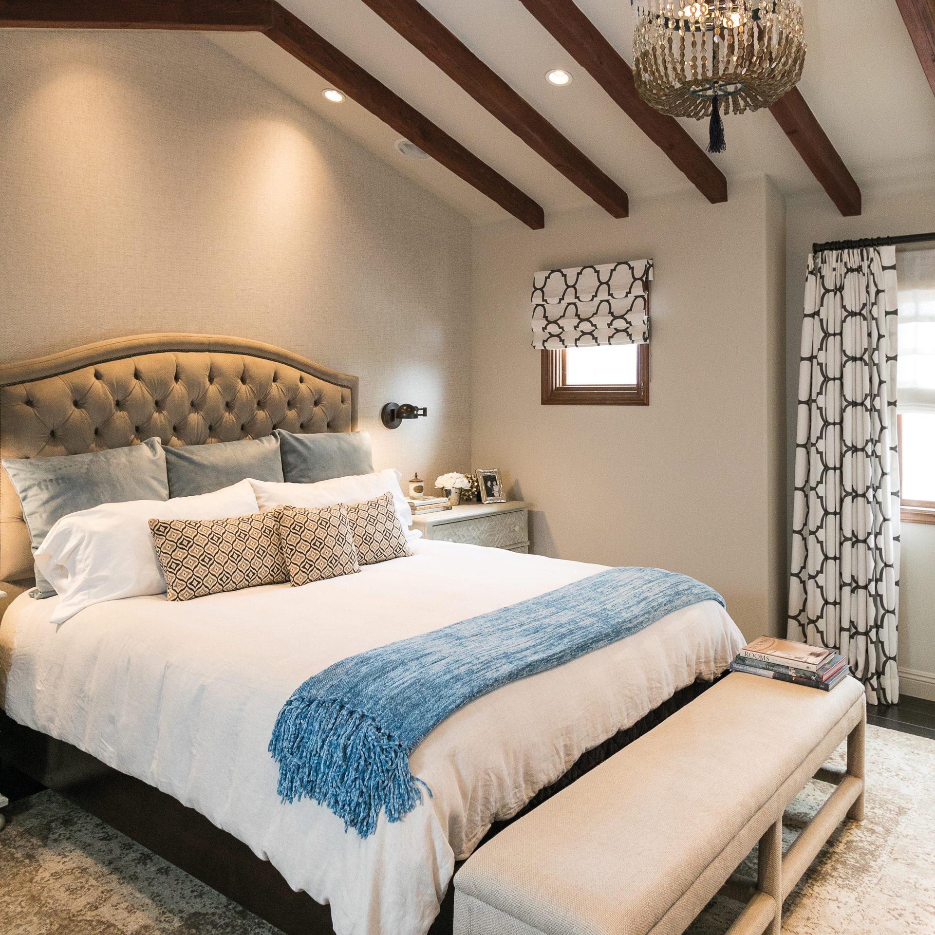
“I love our master bedroom suite,” says Judy. “It’s very tranquil and elegant. We have custom cabinetry by Torben Boesgaard of Concepts In Wood who helped designed the bedroom and bathroom cabinets and master closet while Josette worked on the finishes.”
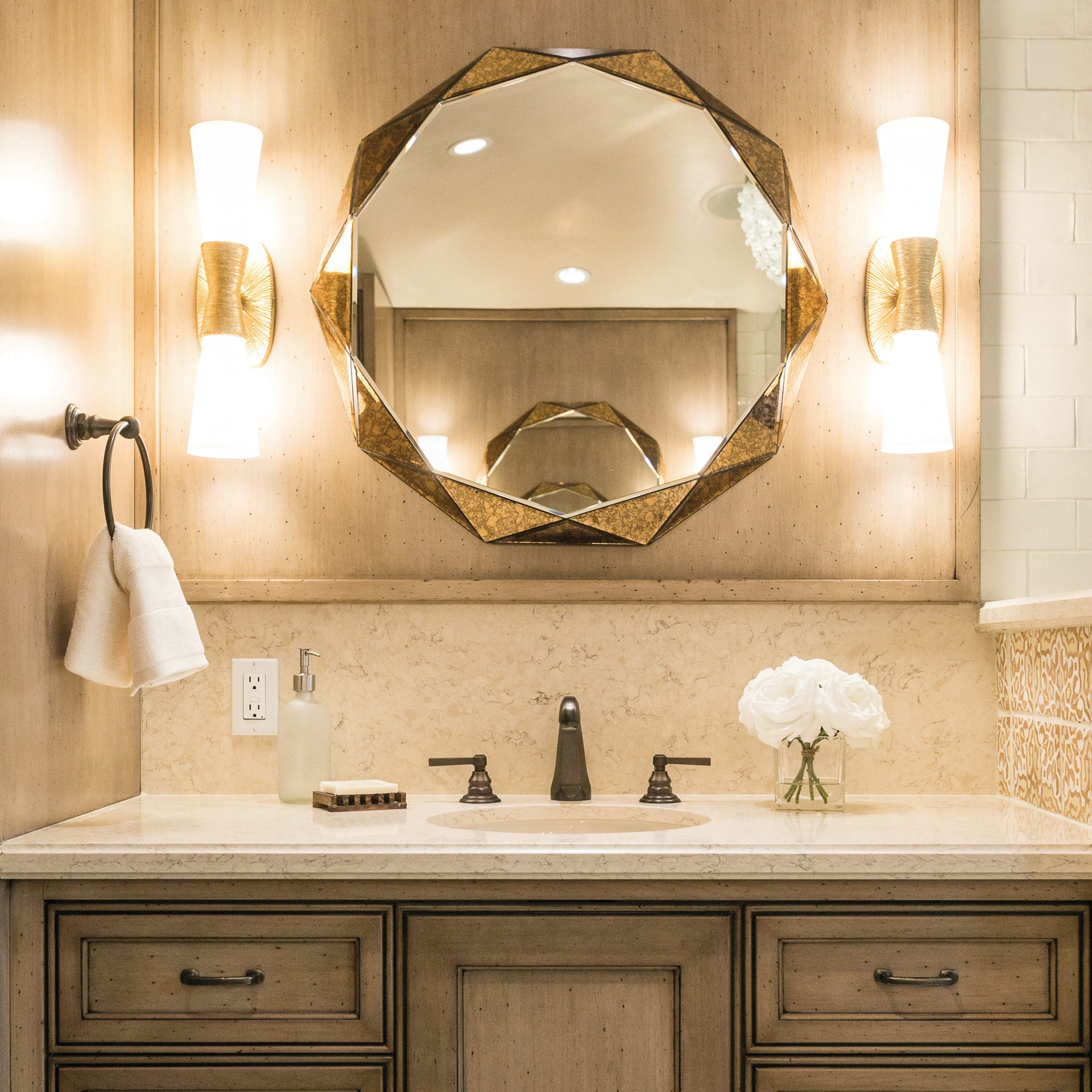
The glamorous master bathroom features Faceted Panels wall mirrors by Brayden Studio; Utopia sconces by Kelly Wearstler for Visual Comfort; a freestanding White Sawyer tub by Americh set inside the shower stall, surrounded by hand-painted wainscot tile from Walker Zanger’s Duquesa collection in Fatima pattern in Ambra color.
“The bathroom had very little storage and counter space,” says Josette. “We splurged on the pattern tile, but everything around it was visually quiet and inexpensive. It was fun. I enjoyed that they had the courage to do this.”
Now the couple, who also spend time at their second home in Santa Barbara, enjoy cooking at home and entertaining with friends and family. “There’s not just one place I like going to,” adds Stephen. “I’m happy just going into each of the rooms.”


