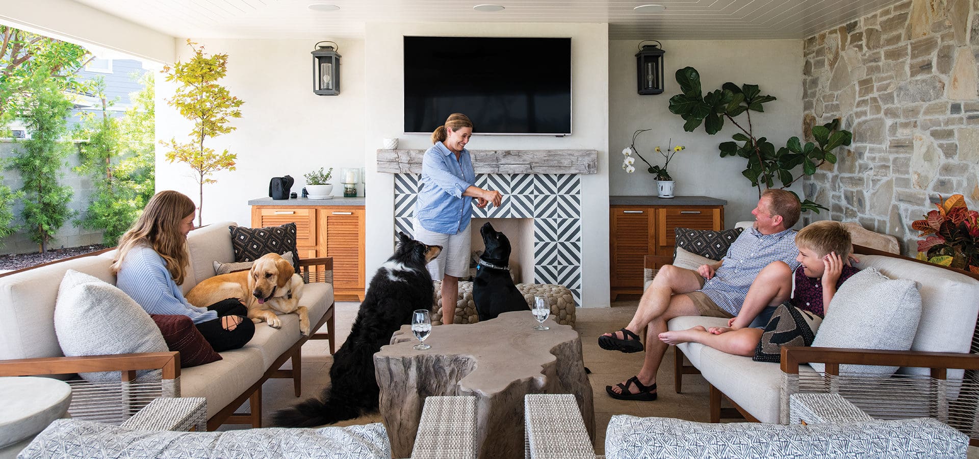
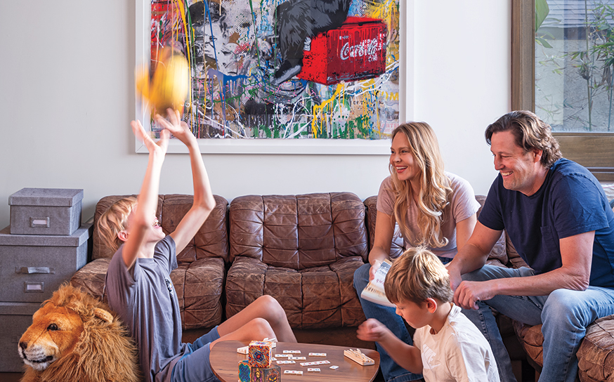
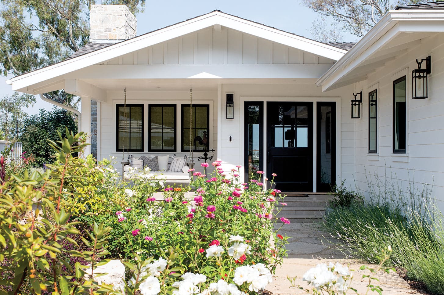
A detailed internet search and a new job opportunity led Christine and Jason Frame and their family to relocate to a ranch-style home in Rolling Hills Estates. “Christine found the house online and told me to check it out one night,” says Jason, who had been living and working in Northern California. “I remember driving up and liking the neighborhood for the mature trees and quiet streets. When I went into the house, I thought we would want to renovate to make it bigger, but the location was great and the view was amazing.”
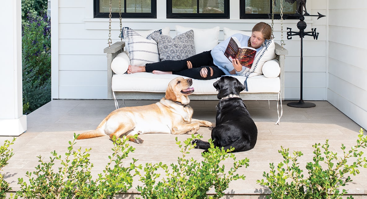
While they knew it was the house, they needed help to create a more functional flow for entertaining, cooking and spending time outdoors with their two children and three dogs: Bandit, Jogger and Gyro. “We envisioned a home that was welcoming and finished in a way that wasn’t going to be out of style in a few years and would fit in with the neighborhood,” adds Christine. “We wanted to utilize the main part of the house as one large room that had to be comfortable for all of us and durable for the family.”
For the interiors, the Frames selected Phil Norman, ASID, principal, and Markie Rudolph, senior designer, of Norman Design Group in Torrance. The firm was a referral from their contractor and builder, John Hopper of Genesis Building and Consulting, who had previously worked with Norman Design Group.
“I went on houzz.com and saved design pictures,” explains Christine. “When I drilled down my favorites, a lot of them were Norman Design Group’s projects. After interviewing a few designers, we chose Phil and Markie because they were interested in getting to know us and what we wanted to feel when we were in our home.”
The design wish list for the single-story home was to create an outdoor room for lounging and enjoying views, and an open layout for the kitchen, dining room and family room with zones for cooking and entertaining. “It was kind of a modest ranch with some 1970s detailing, and we modernized it and took it into more of today’s detailing,” says Phil. “They wanted more entertaining space and a family-friendly environment. They gave us a lot of creative liberty and trusted us, and they were a pleasure to work with.”
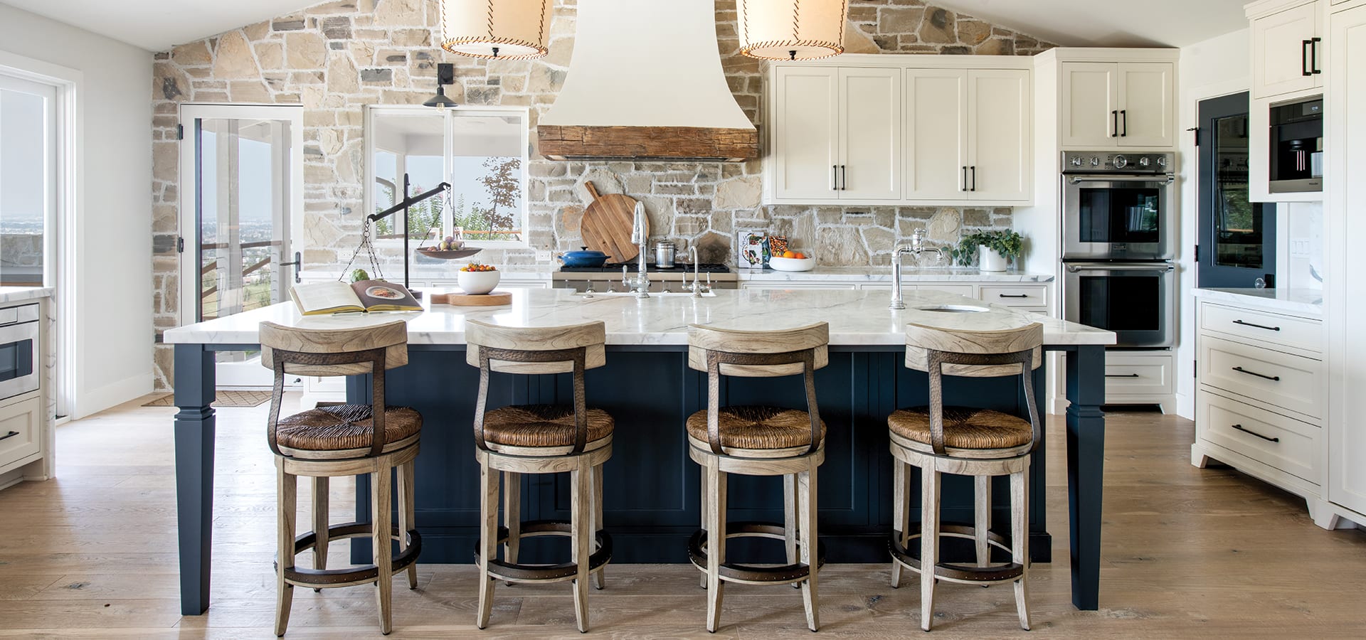
In the 3,330-square-foot home, everything was gutted with the exception of the vertical fireplace masonry box in the living room. It now features vaulted ceilings; durable, 9-inch-wide white oak floors topped with a water polyurethane finish to conceal scratch marks; an outdoor room with a hipped ceiling and a wood-burning fireplace; and a kitchen wall defined with tumbled Lompoc stone.
“I love the shower door and the tile patterns. They were able to bring some uniqueness to every room so it isn’t all the same and make it seem like it all fits together. At the same time, it feels like all things that I like. I don’t feel like I am living in someone else’s house.”
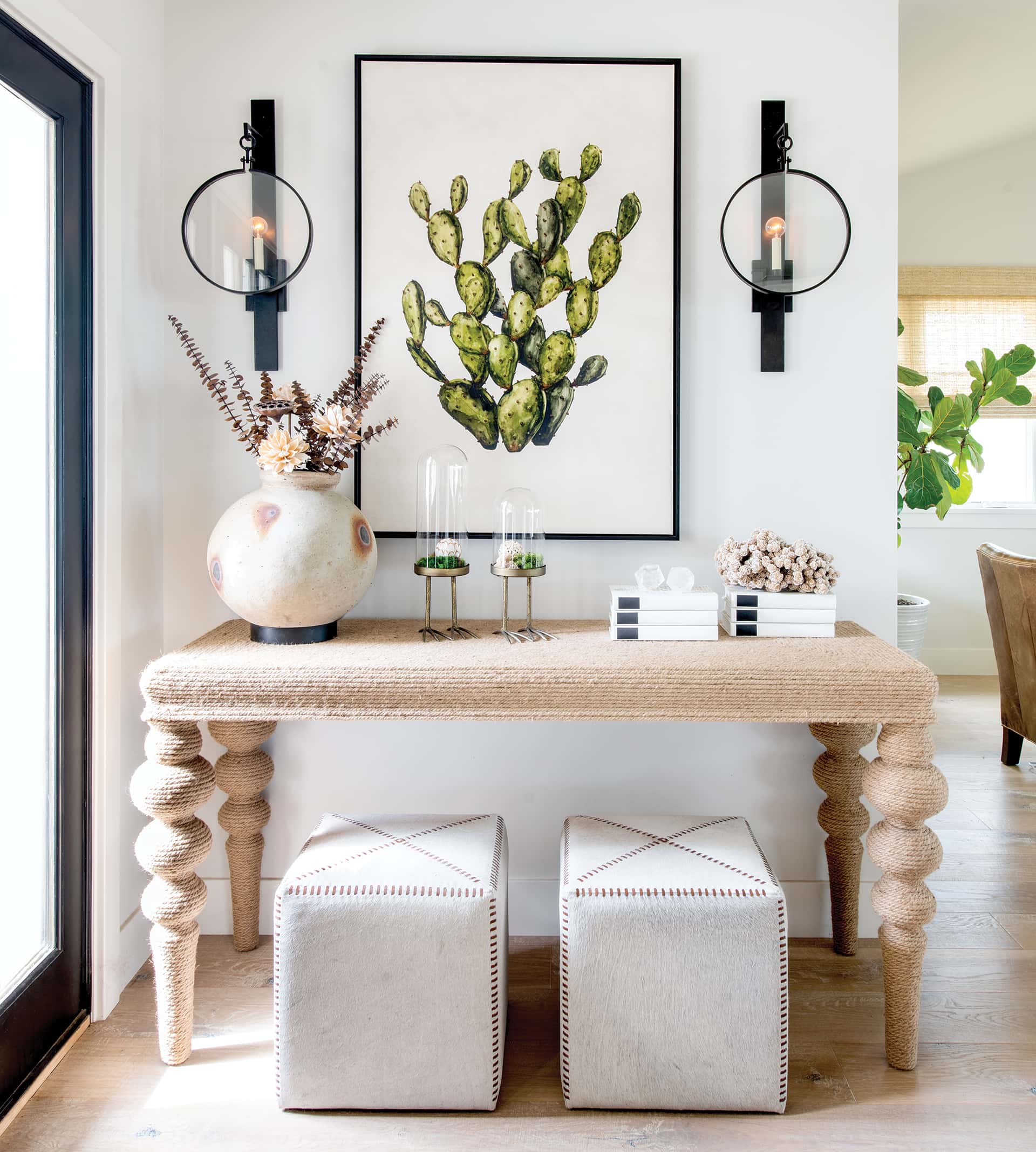
In the front entry, Phil and Markie artfully curated a vignette with a rope-wrapped console table by Palecek; custom hide ottomans by Norman Design Group; sconces by Currey & Company; and a cactus painting by artist Jill Ramsey entitled Sticky Situations. “It sets the tone, and collected and curated pieces are always a point of our interiors,” says Phil. “A more expected piece might be a mirror, and this makes you smile.”
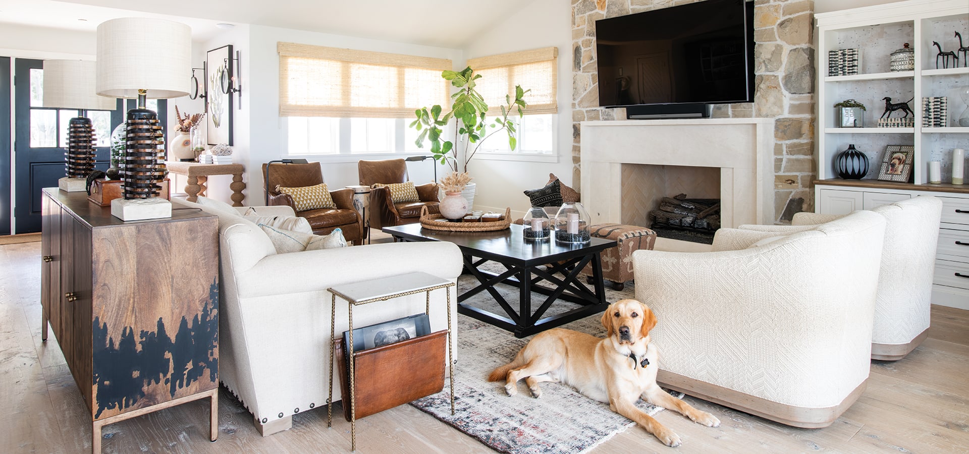
Appointed in warm, calming tones, the living room with a Lompoc stone wall and limestone fireplace surround is dotted with an antique credenza and a cocktail table by Bernhardt. In the adjacent kitchen, the tumbled Lompoc stone acts as a focal wall.
“There’s a great blend of colors with some soft taupes and greys,” says Phil. “We wanted it to have a little bit of a European feel, so we tumbled the stone so it’s a little softer. It’s an element that feels like it has been there for a while.”
The custom kitchen island, designed to resemble an old farmhouse chopping block from the south of France, is anchored with barstools by Bernhardt and a pair of custom hide pendants with contrast stitching by Norman Design Group. “I love the texture of the oversized pendants with the suede lacework, and they cast an amazing glow at night,” adds Phil.
Adjacent to the cabinetry is a discreet pantry with reclaimed oak floating shelves and custom pullouts—a wink at farm-inspired vegetable crates by Norman Design Group.
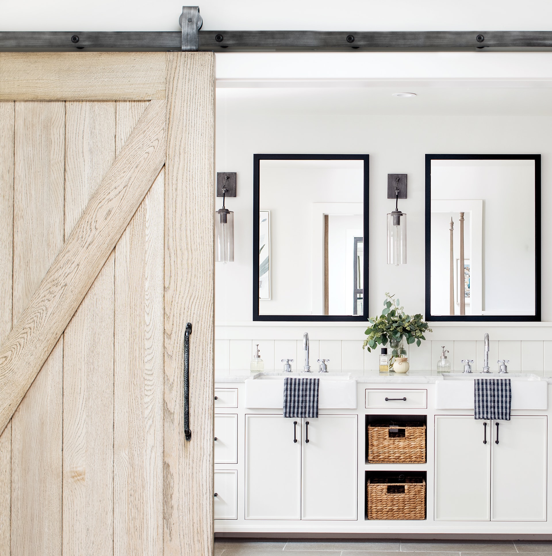
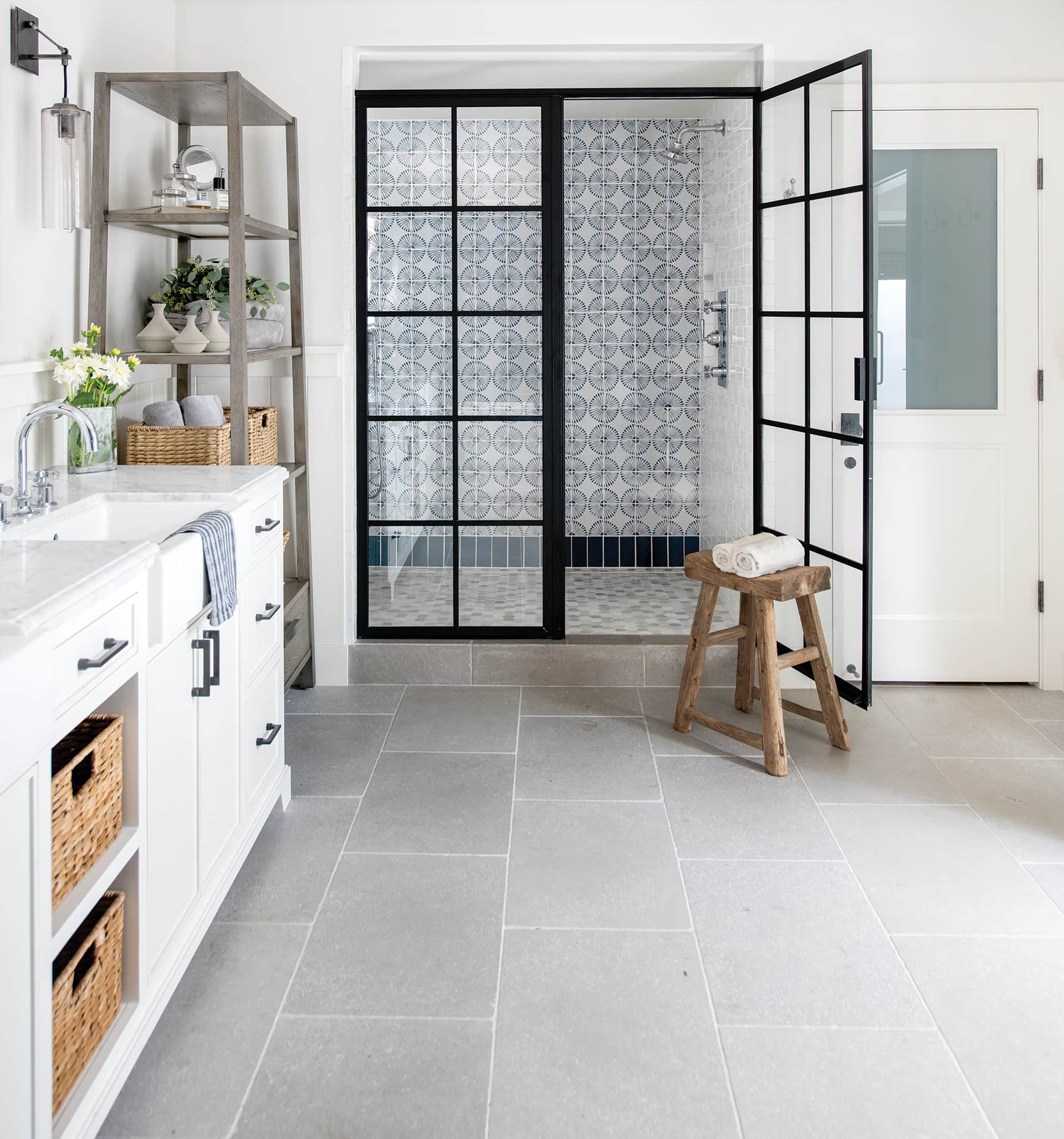
The tranquil palette and cohesive flow continue in the master bath, outfitted with double farmhouse sinks; mirrors that serve as medicine cabinets for extra storage; bush-hammered limestone floors; a shower with beautiful hand-painted “Rue des Rosiers 15” terra-cotta tiles from Tabarka Studio in Los Angeles; and a custom steel door by Norman Design Group.
“I love the shower door and the tile patterns,” says Jason. “They were able to bring some uniqueness to every room so it isn’t all the same and make it seem like it all fits together. At the same time, it feels like all things that I like. I don’t feel like I am living in someone else’s house.”
Spending time in their reimagined home with thoughtful touches is something the Frames value more than ever now. “Back in the day when we used to travel, I would stay in a hotel and wish I was home,” says Christine. “I missed being in our space tailored to our needs. We get to witness beautiful sunsets from the couch, dining table, kitchen and outdoor room. I love being in a beautiful space with my family.”


